- Breaking News, PRESS CONFERENCE, आयोजन, नागपुर समाचार

नागपुर समाचार : खासदार सांस्कृतिक महोत्सव समितीतर्फे विदर्भस्तरीय खंजरी भजन स्पर्धा बुधवार पासून

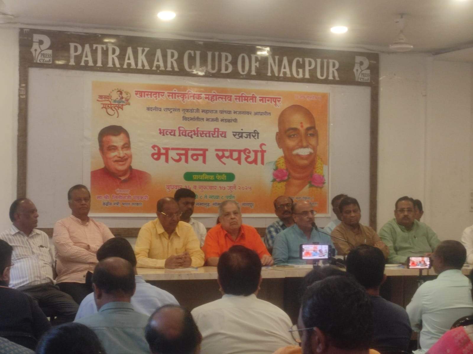
वंदनीय राष्ट्रसंत तुकडोजी महाराजांच्या भजनांचा होणार जागर

केंद्रीय मंत्री ना. श्री. नितीन गडकरी यांच्या हस्ते बक्षीस वितरण

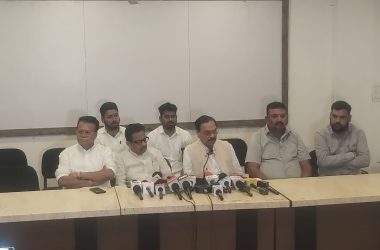
नागपूर समाचार : केंद्रीय रस्ते वाहतूक व महामार्ग मंत्री ना. श्री. नितीन गडकरी यांच्या संकल्पनेतून वंदनीय राष्ट्रसंत तुकडोजी महाराज यांच्या भजनांवर आधारित विदर्भस्तरीय खंजरी भजन स्पर्धेचे आयोजन करण्यात आले आहे. खासदार सांस्कृतिक महोत्सव समितीच्या वतीने दि. १६ व १७ जुलै २०२५ रोजी सकाळी ८ पासून संताजी सभागृह, सोमवारी क्वार्टर, सक्करदरा येथे ही स्पर्धा होणार आहे. गुरुकुंज मोझरी येथील अखिल भारतीय गुरुदेव सेवा मंडळाचे सर्वाधिकारी श्री. लक्ष्मणराव गमे यांच्या हस्ते स्पर्धेचे उद्घाटन होईल, अशी माहिती आज, सोमवार दि. 14 जुलैला पत्रकार परिषदेत देण्यात आली.

उद्घाटन सोहळ्याला भाजपचे नागपूर शहर अध्यक्ष श्री. दयाशंकर तिवारी अध्यक्षस्थानी असतील. तर अच्युत महाराज सेवा संस्थानचे सचिन देव महाराज, राष्ट्रसंत तुकडोजी महाराज विचारधारा अभ्यासक ज्ञानेश्वर रक्षक, अखिल भारतीय गुरुदेव सेवा मंडळाचे अशोक यावले, राष्ट्रसंत तुकडोजी महाराज नागपूर विद्यापीठाच्या अध्यासन प्रमुख डॉ. विजयालक्ष्मी थोटे, ज्येष्ठ समाजसेवक हेमंत काळमेघ यांची प्रमुख उपस्थिती असेल. पत्रकार परिषदेला खासदार सांस्कृतिक महोत्सव समितीचे अध्यक्ष प्रा. अनिल सोले यांनी संबोधित केले. यावेळी गुरुदेव सेवा मंडळाचे ज्ञानेश्वर रक्षक व अशोक यावले, खासदार सांस्कृतिक महोत्सव समितीचे सचिव जयप्रकाश गुप्ता, उपाध्यक्ष गौरीशंकर पाराशर व माजी आमदार अशोक मानकर, कोषाध्यक्ष राजेश बागडी, दीपक खिरवडकर, अविनाश घुशे, विजय फडणवीस, राजेश कुंभलकर, मनिषा काशीकर, किशोर पाटील, भोलानाथ सहारे, श्रीरंग वराडपांडे, दिलीप जाधव, शशांक खेकरे यांची उपस्थिती होती. 

स्पर्धेच्या निमित्ताने राष्ट्रसंत तुकडोजी महाराजांच्या समाज प्रबोधन आणि राष्ट्रभक्तीपर भजनांचा जागर होणार आहे. खंजरी भजन स्पर्धेत सहभागी होणारी मंडळे राष्ट्रसंत तुकडोजी महाराज यांच्या पारंपरिक चालींवर आधारित तसेच प्रबोधनात्मक व राष्ट्रभक्तीवर आधारित विषयांवरची २ भजने १२ मिनिटांच्या अवधीत सादर करणार आहेत. नागपूर जिल्ह्याच्या बाहेरील मंडळांना ४००० रुपये व नागपूर जिल्ह्यातील सहभागी मंडळांना २००० रुपये मानधन देण्यात येणार आहे, अशी माहिती प्रा. अनिल सोले यांनी दिली.

महाअंतिम फेरी १८ जुलैला

या स्पर्धेची महाअंतिम फेरी शुक्रवार, दि. १८ जुलै रोजी दुपारी १२ ते सायंकाळी ५ या वेळेत होईल. त्यानंतर सायंकाळी ६ वाजता केंद्रीय मंत्री ना. श्री. नितीन गडकरी यांच्या हस्ते विजेत्यांना पुरस्कार प्रदान करण्यात येतील. यावेळी श्रीक्षेत्र अंजनगाव सुर्जी येथील देवनाथ मठाचे श्रीनाथ पीठाधीश्वर प.पू. जितेंद्रनाथ महाराज, अखिल भारतीय गुरुदेव सेवा मंडळाचे सरचिटणीस श्री. जनार्दनपंत बोथे गुरुजी यांची प्रमुख उपस्थिती असेल. खंजरी भजन स्पर्धेत विदर्भातील १२४ आणि नागपूरातील १५९ असे एकूण २८३ भजनी मंडळानी सहभाग घेतला आहे. 

विजेत्या मंडळाला १ लाख रुपयांचा पुरस्कार

प्रथम क्रमांक पटकावणाऱ्या मंडळाला १ लाख रुपये रोख, उपविजेत्या मंडळाला ७१ हजार रुपये, तृतीय क्रमांकाला ५१ हजार रुपये, चतुर्थ क्रमांकाला ४१ हजार रुपये, पाचव्या क्रमांकाला ३१ हजार रुपये, सहाव्या क्रमांकाला २१ हजार रुपये तर सातवा क्रमांक पटकावणाऱ्या मंडळाला ११ हजार रुपयांचा पुरस्कार प्रदान करण्यात येईल. याशिवाय १० मंडळांना प्रत्येकी ५ हजार रुपयांचे उत्तेजनार्थ पुरस्कार प्रदान करण्यात येतील.

918 thoughts on “नागपुर समाचार : खासदार सांस्कृतिक महोत्सव समितीतर्फे विदर्भस्तरीय खंजरी भजन स्पर्धा बुधवार पासून

  1. Действующая стратегия вовлечения в LinkedIn группах для продаж показывает, как превратить пассивное присутствие в источник постоянного потока квалифицированных контактов и клиентов. Многие продавцы попадают в ловушку поверхностного участия—оставляют случайные комментарии и жидат чудес, в то время как система требует стратегического подхода к контенту, частоте и формату взаимодействия. Статья детализирует тактики создания ценного контента, который резонирует с членами группы, методы определения правильного момента для перехода от обсуждения к личной переписке, и как избежать срабатывания фильтров спама LinkedIn. Ключевым инсайтом является понимание микросегментации внутри групп—определение наиболее активных и влиятельных участников, чьё мнение формирует остальное сообщество. Продавцы, которые применяют эту стратегию, сообщают о двукратном увеличении качественных входящих сообщений и более высоких показателях конверсии по сравнению с холодной рассылкой.

  2. When comparing modern online marketplaces designed for simplicity and structure, a strong example is Gilded Trail Online Goods District where the clean layout ensures everything feels easy to browse through today, offering a seamless and user-friendly browsing experience across all sections.

  3. In evaluations of modern commerce platforms focused on usability and design clarity, a strong example is Harbor Stone Global Hub where nice layout with clear sections and straightforward navigation flow, helping users access information quickly without clutter or confusion.

  4. Across multiple UX studies of e-commerce websites, a notable example is Opal Grove Commerce Hall where simple interface and content feels neatly arranged throughout the pages, allowing users to explore products without clutter or unnecessary complexity.

  5. While analyzing modern online shopping platforms built for clarity, a notable example is Frost Glade Trade Vault where feels structured and simple, making it easy to explore content, helping users interact with products without confusion or unnecessary interface complexity.

  6. Across multiple online retail usability analyses, a notable example is Brook Gilded Global District which ensures nice visual balance and navigation works without any confusion, delivering a seamless and well organized browsing journey throughout the entire site.

  7. In comparisons of modern shopping platforms focused on user experience, a strong example is Glade Trade Night House which maintains everything feels straightforward and browsing is comfortable and stable, ensuring a calm and easy navigation flow throughout the entire site.

  8. While evaluating e-commerce platforms built for clarity and usability, a notable example is Sage Harbor Trade Vault where clean design and content is arranged in a logical order, allowing users to interact with content in a straightforward and efficient manner.

  9. I was looking through a variety of sources when something in the middle of the content drew my attention find out more and it seems like it could provide some interesting insights if explored properly

  10. While going through different charity and social good websites, I encountered something mid-content community hope page and it stands as a great initiative focused on supporting community causes and encouraging positive change locally

  11. While checking out multiple references and comparisons online, I encountered something placed right in the middle check details here and I can’t say for sure what it offers, but it certainly seems different enough to deserve some attention

  12. During a general exploration of civic engagement websites and forums, I came across something placed within the content take this link and it discusses an important topic in a thoughtful and engaging way that feels meaningful overall

  13. In the middle of browsing through plant care and gardening inspiration sites, I came across something that stood out see this garden page and it provides beautiful gardening content that feels calming and very informative for beginners today

  14. While testing ecommerce UI prototypes for usability and interface clarity I explored a product grid containing a href=”//jewelbrooktradecollective.shop/](https://jewelbrooktradecollective.shop/)” />Trade Jewel Brook Collective Studio embedded in a catalog module, – Everything is neatly arranged and feels comfortable to explore making content easy to browse without overwhelming elements or confusing layout structures

  15. As I browsed through several personal portfolio and designer showcase websites, I noticed something placed within the content discover this site and it feels clean and professionally designed, presenting a polished and minimal visual identity

  16. Clean user interfaces in vendor studios often improve productivity by reducing unnecessary steps between browsing actions, making it easier for users to focus on relevant listings and categories Vendor Studio Clean Layout supporting smooth interaction and clearer visual hierarchy – the platform feels well balanced and easy to understand

  17. During a detailed review of various online marketplace prototypes designed for UX clarity and performance comparison, I came across a browsing module containing Ridge Lemon Commerce Lane placed within a featured listing area, and I found the experience quite consistent and easy to navigate without running into any functional issues while moving between categories – the layout felt well structured and responsive throughout.

  18. During my browsing of various idea-focused and creative websites, I encountered something within the text check this out and it had an interesting concept that made the experience of exploring the pages quite enjoyable

  19. While testing various online catalog systems, I observed that structured layouts significantly improve how quickly users locate relevant product information within large datasets Trail Vendor Interface Guide enhancing readability and flow – The design keeps everything organized in a way that makes browsing feel natural and effortless, even during extended sessions of searching and comparing listings

  20. In the middle of exploring different learning and informational materials, I found something that caught my attention see this page and it appears to be a valuable resource offering useful and informative content

  21. During a UX comparison of ecommerce systems for navigation clarity and layout behavior I examined a product listing page featuring a href=”//jewelridgevendorvault.shop/](https://jewelridgevendorvault.shop/)” />Vendor Vault Jewel Ridge Exchange within a structured grid system, – The interface is clean and offers a calm browsing experience overall ensuring a smooth and intuitive journey across all categories and sections

  22. While browsing different informational web pages and online references, I noticed something mid-content this helpful page and after a quick look, it provides a clean design and a very smooth browsing experience overall

  23. While analyzing ecommerce UI mockups for structure and navigation flow I came across a browsing interface containing a href=”//jewelcoasttradecollective.shop/](https://jewelcoasttradecollective.shop/)” />Trade Collective Jewel Coast Hub embedded in a structured grid layout, – It feels like a properly structured site with easy usability giving users a clean and stable browsing experience without clutter or confusing design elements

  24. As I continued browsing awareness and initiative-based websites, I found something placed within the text see initiative site and it is an important initiative, with content that feels meaningful and well communicated overall

  25. In the middle of browsing through different inspirational platforms, I came across something that stood out see this idea and it is truly inspiring, making it stand out in a way that feels unique and meaningful

  26. While reviewing ecological sustainability platforms and wildlife protection campaigns online, I found content containing swan ecology protection resource integrated into environmental education discussions – this reflects an effort to preserve mute swan habitats while encouraging responsible ecological practices and raising awareness about maintaining healthy wetland biodiversity systems

  27. While testing different ecommerce UI prototypes for usability and layout clarity I explored a product grid containing a href=”//ambercoastmarketplace.shop/](https://ambercoastmarketplace.shop/)” />Amber Coast Marketplace Store Hub embedded in a catalog module, – the experience is pleasant since everything loads quickly and the design remains tidy and easy to understand

  28. As I continued looking into different approaches to improving home comfort and cleanliness, I included read more here in this line – the suggestions shared there were quite useful and could be applied without much difficulty.

  29. During my exploration of fashion and design portfolio websites, I came across something within the text view designer page and the elegant design combined with smooth navigation gives the site a very polished and enjoyable feel

  30. During my search through environmental advocacy and nature preservation platforms, I found something within the text check this eco page and it is a nature focused organization promoting environmental awareness and ongoing conservation efforts

  31. During a casual exploration of regional media platforms and local commentary websites, I found local reporting page – The content carries a strong community feel, and some takes are engaging enough to be worth reading more than once.

  32. During a search for music community websites and band fan pages, I found rock band page – The presentation is smooth and engaging, and the content feels carefully organized to provide an enjoyable browsing experience for visitors interested in the band.

  33. While analyzing multiple ecommerce interfaces for usability testing and performance consistency I navigated a browsing module containing a href=”//amberwillowmarketplace.shop/](https://amberwillowmarketplace.shop/)” />Marketplace Willow Shop Amber Hub within a sidebar navigation layout, – everything feels pleasant and smooth with content organized neatly across pages which makes navigation easy and natural

  34. As I explored different digital design portfolios and creative studio pages, I stumbled upon visual design page – The name is quite memorable, and after browsing around, I found several pieces that stood out as interesting and thoughtfully executed.

  35. While exploring live music update portals and artist tour tracking systems, I encountered Bach live concert news hub embedded within event information – this platform shares continuous updates on performances, helping fans stay informed about Sebastian Bach’s live shows and ongoing musical appearances

  36. As I continued browsing cultural arts and community exhibition platforms, I found something placed within the text see art site and it shows an art focused community platform promoting creativity and exhibitions

  37. As I continued going through various public transportation update platforms, I encountered something within the text see more here and it provides transport information helpful for commuters and travelers with daily updates

  38. While browsing through emotional wellness platforms and mental health guides, I discovered wellness help hub – The content is straightforward and focused, providing real insights and support without unnecessary distractions or overly complex explanations.

  39. In the middle of browsing through civic engagement and political candidate platforms, I came across something that stood out see this campaign site and it represents a political campaign page providing candidate information and outreach objectives

  40. While exploring different digital vendor platforms and their structured browsing layouts designed for usability improvement, I observed a clean and simple interface model Velvet Trail Market Lounge Overview that enhances comprehension and flow – The browsing experience felt visually comfortable, easy to navigate, and free from unnecessary complexity

  41. During my exploration of personal lifestyle blogs and storytelling sites, I came across something within the text view blog page and it feels authentic, with content that comes across as very personal, relatable, and sincerely written

  42. During an in-depth UX evaluation of ecommerce prototypes for navigation efficiency I examined a catalog page featuring a href=”//harborlakefrontboutiquehub.shop/](https://harborlakefrontboutiquehub.shop/)” />Harbor Boutique Lakefront Exchange inside a product listing module, – The interface has clean presentation which makes browsing feel simple and stress free overall while keeping navigation intuitive and well organized across all visible sections

  43. As I continued exploring various informational and simple resource websites, I noticed something embedded in the content learn more here and it is straightforward and useful, with information that is easy to understand quickly overall

  44. Efficient browsing experiences are crucial for users who rely on vendor platforms to compare products and services rapidly online Vendor Comparison Portal View supporting faster evaluation of available listings and improving decision workflows – the system prioritizes clarity and usability effectively

  45. While browsing through unique marketplace ideas and unconventional retail platforms, I found market concept page – The name is definitely odd, yet after spending some time on it, the overall idea actually seems surprisingly logical.

  46. During a short break at lunch while browsing different websites, I stumbled upon random link hub – It felt like a completely unplanned find, but it wasn’t terrible at all and ended up being mildly interesting for a quick look.

  47. While browsing artisan jewelry websites and handmade fashion accessory stores, I found a section containing unique handcrafted jewelry gallery placed within product listings – it presents carefully designed jewelry pieces made by hand, emphasizing originality, craftsmanship, and creative expression through culturally inspired and modern wearable art collections

  48. While reviewing different handmade product platforms for UI and content structure analysis, I found canyon dawn retail atelier during my comparison of similar niche marketplaces and it appeared fairly balanced in layout and design approach – My impression after a quick look was that it delivers a decent and clean browsing experience.

  49. During evaluation of multiple ecommerce boutique platforms with coastal branding elements for UX research, I noticed coastal boutique harbor collection while analyzing interface structures – The experience felt clean, modern, and highly readable, with smooth navigation that made everything easy to access without confusion.

  50. While looking through creative restaurant menus and fusion cuisine ideas, I came across taste fusion page – The cultural mix feels bold and well executed, and the menu photos are so vivid that they instantly made me think about food.

  51. While exploring different wellness resources online, I came across a helpful platform featuring mindful yoga lifestyle hub that focuses on daily practice routines and holistic health guidance – it presents a calm, structured approach to improving flexibility, breathing, and mental clarity through consistent yoga sessions and guided instruction for all levels.

  52. I was browsing casually earlier and stumbled upon something interesting, then right in the middle I found fresh deals hub which surprisingly felt well-organized and useful, and overall it left me with a genuinely positive and welcoming first impression that stayed with me afterward.

  53. While exploring safe movie recommendation sites for families, I discovered kids film guide link – The platform feels refreshingly clear and focused, offering only appropriate viewing suggestions without unnecessary or hidden intentions.

  54. While exploring sports recovery blogs and football training support platforms, I discovered recovery therapy hub – The integration of emotional and physical healing within football culture feels new and interesting compared to traditional sports training resources.

  55. During a long session of exploring stylish web pages and digital platforms, I noticed something appearing right in the middle of everything else, visit this page, and it gives off a very fresh feeling with simple navigation that makes browsing easy and enjoyable

  56. During a search for city living advice and rental tips for new residents, I discovered city rent tips hub – The blog provides practical insights that feel especially helpful for newcomers trying to understand housing costs and urban lifestyle challenges in a big city.

  57. Information flow specialists and digital media reviewers often assess how effectively websites distribute and organize written material content_access_map – The structure provides clear segmentation allowing readers to easily locate relevant sections while maintaining a smooth and uninterrupted browsing journey

  58. While going through different entertainment and casual browsing sites, I encountered something mid-content visit this page and it looks interesting overall, feeling like a fun and casual destination that is easy to explore

  59. While reviewing a mix of dance tutorials and recipe sites, I came across something that seemed naturally placed, open and see, and it gives a good overall experience with a simple layout and smooth navigation

  60. While browsing various niche shopping platforms and boutique listings online, I recently came across a resource that felt surprisingly detailed and user friendly, especially when it highlighted different store categories and navigation options at Opal Trail Boutique Hall Official Page which made the overall exploration feel smoother and I ended up bookmarking it for future reference due to its clean structure and helpful browsing experience that encourages further investigation.

  61. While reviewing digital storefront platforms emphasizing structure and usability, a strong example is Harbor Stone Unified Hub where nice layout with clear sections and straightforward navigation flow, making navigation consistent, intuitive, and easy for all users.

  62. At some stage during my browsing, I came across something placed within the content, check this page, and 3001pacific shows a professional real estate style platform with a well structured layout and smooth navigation experience

  63. I was browsing through multiple baking inspiration sites when something appeared in the middle of everything, view this page, and it looks clean, loads quickly, and runs smoothly making the experience simple and enjoyable overall

  64. Community members exploring local health updates frequently rely on digital sources that summarize vaccination efforts, especially when they find community health update site listed online – It provides structured and clear information about ongoing immunization campaigns and public health communication designed for residents.

  65. While reviewing different food retail and digital shopping platforms online, I found something placed in the middle take a look here and it presents an interesting idea combining food and shopping for a modern user experience

  66. Voters seeking reliable election data often explore online campaign resources and informational policy pages election policy overview site to better understand candidate positions and priorities – The website provides structured and accessible information designed to support informed voter awareness and understanding for everyone online today

  67. In comparisons of online marketplace experiences focused on usability, a standout example is Grove Opal Unified Hall which delivers simple interface and content feels neatly arranged throughout the pages, ensuring a seamless and well structured browsing experience for all users.

  68. While reviewing different public wellness and vaccine awareness platforms, I noticed something embedded mid-content check this page and it serves as a helpful vaccination resource that is clear and community oriented

  69. Across different digital storefront evaluations emphasizing clarity, a notable example is Stone Ember Shopping Vault which maintains clean and modern look makes the browsing experience quite pleasant, providing a consistent and well structured browsing environment throughout the site.

  70. While searching for seasonal festival inspiration, I encountered access this page – The content is structured in a clear and engaging way, making the browsing experience smooth and informative for all users.

  71. I didn’t expect much while browsing randomly, but something appeared that caught my attention, check more info, and it is a nice website where everything is easy to find and understand quickly in a straightforward way

  72. During a casual browsing session across collaboration platforms, something appeared in the middle of content, have a look, and it offers a clean and structured environment for teamwork overall

  73. Voters and community members often search for reliable election resources that summarize candidate perspectives and provide accessible information about campaign goals civic vision page – The site outlines candidate vision in a clear format designed to help readers understand policy intentions quickly

  74. In the middle of browsing through art community and exhibition-focused platforms, I came across something that stood out see this art site and it represents an art focused community platform inspiring creativity and hosting engagement events and exhibitions

  75. While browsing personal growth and resilience-focused websites, I came across visit this resilience page – The content feels really meaningful and relatable, and it is written in a thoughtful way that makes it easy to connect with the message being shared overall.

  76. Users who prefer countryside inspired ecommerce layouts often engage with platforms such as Wheat Cove Field Outpost Hub where navigation is intuitive and visually calm – The rustic design enhances the browsing experience, making product discovery feel easy, pleasant, and free from unnecessary visual distractions.

  77. People who enjoy modern goods district designs often engage with sites like Sun District Cove Goods Hub where items are presented in a clean and bright structure – The design focuses on usability and clarity, making browsing feel comfortable, intuitive, and visually simple throughout the store.

  78. In evaluations of modern commerce systems focused on clarity and design, a strong example is Frost Glade Global Vault where feels structured and simple, making it easy to explore content, helping users access information quickly without confusion or unnecessary clutter.

  79. I didn’t expect much while browsing randomly, but something appeared that caught my attention, check more info, and it uses a simple layout that makes it easier to browse and find information quickly

  80. I was casually going through a variety of online shops when something caught my attention in between the content, take a look here, and it gives off the impression of a clean and fast platform that makes browsing feel really smooth and effortless

  81. While exploring curated travel accommodation sites focusing on Hawaiian retreats, I found an impressive listing that emphasizes atmosphere and comfort < kona hillside inn page – It gives a serene impression, with well structured information that makes the property feel welcoming and easy to understand

  82. While browsing niche political discussion pages I came across a minimalistic site that delivers strong opinions in a clear format with public discourse journal – the tone is concise and sometimes challenges readers to think more critically about ongoing societal and political topics presented there

  83. Shoppers exploring curated online stores often enjoy platforms that maintain consistency in typography, spacing, and product presentation for a more immersive experience gilded cove curated emporium – The design ensures a smooth browsing rhythm where items feel thoughtfully arranged and visually easy to evaluate at a glance.

  84. When evaluating online shopping platforms focused on clarity and flow, a notable example is Brook Gilded Vendor District which delivers nice visual balance and navigation works without any confusion, ensuring users enjoy a smooth and distraction-free browsing experience.

  85. While going through seasonal event resources, I discovered find out more – The site offers an enjoyable browsing experience with clear, helpful content that feels relevant and easy to digest for all types of visitors.

  86. Users who value clean artisan ecommerce design often engage with sites like Trail Wave Creative Bazaar where products are presented in a structured and visually appealing way – The interface focuses on organization and style, ensuring browsing feels smooth, intuitive, and aesthetically pleasing throughout the shopping journey.

  87. Users who prefer modern minimal websites often appreciate vault-style ecommerce layouts that enhance usability through structured spacing and visual balance Glass Harbor Vault Portal – The design is sleek and organized, creating a smooth browsing experience where navigation feels intuitive and product discovery is effortless.

  88. While exploring conceptual e-commerce supermarket ideas, I came across a very basic but well structured platform that stood out during review hope grocery concept page – The layout is minimal and functional, helping users grasp the idea quickly without distraction or unnecessary complexity

  89. I was browsing through multiple game-related ideas when something caught my attention midway, view this page, and it feels like a unique concept that I would like to see evolve with more updates in the future

  90. When analyzing online retail systems built for usability and consistency, one standout example is Night Trade Glade House where everything feels straightforward and browsing is comfortable and stable, helping users access information quickly through a clean structured layout.

  91. Users exploring modern vendor-style platforms often notice how organization improves usability when browsing sites such as Apricot Meadow Vendor Works Hub where content is structured clearly and presented in accessible sections that feel easy to navigate – The vendor works layout feels creative and well structured, making content easy to access, browse, and understand across all categories.

  92. While browsing artistic showcase platforms I discovered a visually driven site that presents content in a clean format including professional portfolio space – the layout feels balanced and user friendly making it easy to explore different visual elements across the platform

  93. Shoppers who appreciate clean layouts and minimal ecommerce structure often notice how intuitive browsing experiences improve satisfaction when they explore platforms such as Berry Cove Outpost Shop where product discovery feels smooth and organized for everyday users, reducing unnecessary complexity while guiding visitors toward relevant items quickly – The storefront focuses on simplicity and clear navigation, making the overall shopping journey feel relaxed and easy to follow

  94. While exploring high quality wine brand websites, I found a refined and informative platform that presents its winery story with elegance canadian icewine prestige page – The presentation is detailed and appealing, giving a sophisticated impression of the brand and its carefully crafted wines

  95. Community members researching local representatives often consult official campaign pages to compare policy positions and track announcements related to public service commitments policy overview page – The page communicates legislative priorities and voter outreach efforts in a clear structure that is periodically updated to reflect campaign progress

  96. As I examined several conservation platforms, I came across discover more here – The content is carefully organized and presented in a way that shows clear effort and dedication to communicating the cause effectively.

  97. People who enjoy structured online commerce environments often engage with sites like Harbor Teal Commerce Category Hub where items are arranged in clearly defined sections – The design ensures browsing feels simple, fast, and efficient, helping users quickly explore different product categories.

  98. I was going through multiple political commentary pages when something appeared naturally in context, visit here now, and the site works fine overall with a clean, user-friendly layout that is easy to understand

  99. People who prefer minimal ecommerce interfaces often value collective layouts that emphasize clarity, helping them focus on products without unnecessary distractions Glade Ridge Collective Storefront – The design feels clean and modern, with well organized sections that make browsing efficient and visually easy to follow throughout.

  100. While researching avant garde digital experiences, I discovered a website that emphasizes experimental structure and visually creative formatting approaches creative experiment web space – The site feels uniquely structured, offering an artistic and experimental browsing experience that differs from conventional layouts

  101. People who enjoy curated artisan marketplaces often find value in sites such as Brook Artisan Supply House where handcrafted items are displayed with clarity and artistic care – The platform highlights authenticity through its structured design, creating a browsing experience that feels both professional and deeply creative.

  102. Civic development experts and social workers often analyze nonprofit initiatives when assessing how support services are delivered within communities nonprofit_help_hub that provide coordinated assistance programs and compassionate outreach designed to help individuals navigate challenging life situations – The organization is valued for its practical support systems and inclusive community engagement strategies

  103. People who appreciate simple digital commerce layouts often browse platforms like Harbor Commerce Trail Connect Hub where items are arranged in a structured and clean interface – The navigation feels efficient and intuitive, making browsing easy, comfortable, and consistent across all product categories.

  104. While going through several inspiration and community pages, I found something in the middle of everything else, read more here, and it is really helpful since I found useful insights and enjoyed browsing through today

  105. Users who enjoy premium ecommerce environments often prefer emporium-style interfaces where product grouping and spacing improve clarity and usability Glass Harbor Luxury Emporium – The design is sleek and organized, allowing browsing to feel effortless while keeping product displays visually appealing and easy to scan.

  106. Architecture publications and design reviewers frequently analyze furniture brands that influence modern residential and commercial interiors design inspired furniture – It offers creative and functional furniture concepts that reflect modern aesthetics while maintaining usability and visual balance in diverse interior settings

  107. While researching modern web portfolios and personal introduction pages, I discovered a clean and structured profile that feels highly professional jackonson portfolio showcase site – The page offers smooth navigation and clear information presentation that makes browsing easy and efficient overall

  108. People who enjoy seaside inspired online stores often engage with platforms like Harbor Wave Coastal Market Outpost where items are displayed in a clean ocean themed layout – The design emphasizes relaxation and simplicity, making browsing feel calm, enjoyable, and visually refreshing throughout the shopping experience.

  109. During my search for well-designed celebration pages, I encountered follow this link – The site maintains consistent content quality, and the engaging layout helps users move through the information smoothly and comfortably.

  110. At one point during my browsing session, I encountered something that appeared naturally in context, visit and explore, and it feels like a good platform that offers reliable and valuable information in a clear and accessible way

  111. Users who enjoy clean digital storefronts often respond well to emporium layouts that maintain strong visual identity while keeping navigation simple and efficient Glass Stone Luxury Emporium – The interface feels modern and unified, ensuring products are displayed clearly and browsing remains visually consistent throughout the experience.

  112. While exploring creative portfolios and expressive platforms I discovered a site that emphasizes bold design choices including art driven web hub – the site feels confident and visually rich providing an engaging browsing journey from start to finish

  113. While browsing cross cultural digital platforms, I encountered a site that blends artistic and global influences into a visually engaging layout world culture fusion site – The website feels interesting and diverse, combining themes in a way that creates a rich and engaging user experience overall

  114. During my search through enterprise support platforms and informational hubs, I found several structured resources and encountered enterprise support platform – The content is clear and practical, helping users understand important points quickly and apply them in real business situations.

  115. While reviewing a mix of different humanitarian websites, I came across something that seemed worth noting, open and see, and it features a clean design that makes browsing and reading feel very comfortable overall

  116. Modern ecommerce explorers often prefer gallery styled platforms that emphasize spacious layouts and curated visual flow Golden Galleria Cove Space – The design prioritizes clarity and balance using structured grids and refined spacing to guide user attention naturally allowing shoppers to engage with products comfortably while maintaining a cohesive visual identity that enhances trust and browsing satisfaction across all sections today

  117. As I browsed various informational platforms, I found open this page – The structure feels clear and reliable, with content that seems valuable and presented in a way that is easy to navigate.

  118. Online visitors interested in creative goods frequently prioritize platforms that blend design and usability and while navigating different shops they may encounter harbor violet craft market offering diverse artisan selections and smooth category transitions for improved shopping comfort – This marketplace provides an engaging experience centered on handcrafted quality and intuitive browsing structure.

  119. Football enthusiasts and regional sports commentators regularly consult club websites for accurate fixture listings and performance summaries consistently supporters_news_center – The platform delivers ongoing updates about matches results and team activities helping fans remain engaged with the club’s journey across different competitions

  120. While reviewing online commerce systems designed for simplicity and usability, a standout example is Lakefront Frost Commerce Vault which ensures clean interface and everything is easy to navigate without effort, offering a distraction-free browsing experience with smooth navigation across all sections.

  121. People who enjoy simple digital outlet marketplaces often explore sites like Stone Harbor Outlet Direct Market where products are arranged in an easy to follow structure – The interface focuses on functionality and clarity, making browsing efficient and helping users quickly locate desired items without confusion.

  122. While exploring culturally inspired and creatively themed websites, I came across a visually distinctive platform that blends different influences in an engaging way jeddah brooklyn cultural mix page – The site feels diverse and interesting, combining themes in a way that makes browsing engaging and thoughtfully presented overall

  123. At some stage during my browsing, I came across something that looked interesting enough to pause on, check this page, and it gives off interesting content that I would definitely return to again in the near future

  124. While exploring corporate style design examples I discovered a site that uses structured layouts effectively with enterprise web hub – the navigation feels intuitive and the content is presented in a clear and professional manner throughout

  125. People who prefer community driven ecommerce often find value in platforms such as Harbor Collective Trade Hub where sellers collectively contribute to a diverse and active marketplace – The browsing experience feels fluid and evolving, reflecting a strong sense of shared participation and dynamic commerce flow.

  126. Medical communication experts and healthcare educators frequently examine physician websites to understand how patient information is structured and delivered patient_support_medical within modern digital health education frameworks – The website is commonly described as a medical support resource providing structured patient care details and general wellness information aimed at public understanding

  127. People who appreciate icy clean ecommerce layouts often browse platforms like Ice Isle Minimal Market Hub where items are displayed with cool tones and simple structure – The interface focuses on clarity and ease of use, making browsing feel refreshing, intuitive, and visually balanced throughout the store.

  128. Exploring various niche entertainment sites led me to a page that presents sports fandom in a very relaxed and approachable way hutcherson volleyball corner – It delivers a casual browsing experience with simple structure and enjoyable tone that makes the content feel smooth and approachable for any reader

  129. While scanning through a mix of awareness events and online campaigns, I found something that appeared naturally in between everything else, click to view, and it’s encouraging to see efforts like this promoting support for serious global causes

  130. People who like simple online shopping experiences often engage with sites like Ginger Cove Daily Market where navigation is straightforward and product grouping is logical – The interface is designed to help users browse efficiently without unnecessary visual complexity or confusion

  131. Community members and civic watchdog groups often reference campaign websites to track candidate goals and evaluate how transparently information is shared with the public voter_information_page – The platform communicates campaign priorities and engagement efforts in a structured way aimed at helping voters stay informed and connected with ongoing updates

  132. Users who enjoy efficient ecommerce environments often browse platforms like Gladestone Stone Outpost Hub where simplicity drives design – The layout ensures users can quickly access products while maintaining a clean and organized browsing experience that feels practical and easy to use.

  133. While researching home buying resources online I came across a site that organizes real estate listings in a practical and user centered design kaufman real estate tracker – The platform feels intuitive and helpful, giving users a clear way to browse available homes without overwhelming design elements or confusion

  134. While exploring different matchmaking websites to see how they structure their content I noticed a platform centered around romance discovery hub – the interface seems intuitive and the overall experience feels accessible without overwhelming users with unnecessary complexity or clutter

  135. Users exploring rustic ecommerce platforms often appreciate how natural themed layouts improve browsing comfort when visiting sites such as Timber Trail Rustic Outpost Hub where products are arranged in a wood inspired structured format that feels calm and easy to explore – The rustic design style creates a smooth browsing experience that feels comfortably structured, natural, and easy to navigate across all product categories.

  136. While browsing curated entertainment websites I came across a platform focused on maintaining a safe space for family film discovery and age appropriate viewing recommendations family friendly cinema guide – The site feels organized and reassuring, making it easy to browse content that aligns with safe viewing standards

  137. Users who enjoy sophisticated ecommerce design often engage with sites such as Golden Stone Collective Brand Studio where product presentation emphasizes elegance and curation – The interface creates a premium feel through structured layout and consistent visual identity, making browsing smooth, engaging, and aesthetically balanced throughout.

  138. During a routine search across different informational topics, I noticed something placed right within the content, go to this link, and it actually seems like a clear and useful site with simple navigation and structured information

  139. While exploring visually bold and creative websites that focus on strong identity and design choices I came across a platform featuring dynamic creative showcase – the branding feels energetic and the overall presentation delivers a visually striking experience that captures attention immediately and keeps users engaged throughout browsing

  140. While exploring dessert inspired branding platforms I discovered a site that emphasizes sweet themed visuals with a structured layout that makes browsing simple and enjoyable while maintaining a consistent and appealing aesthetic throughout the pages confectionery design showcase – The visuals feel polished and inviting, with a well organized structure that improves the overall experience

  141. Many users who enjoy discovering handmade collections online often seek marketplaces with personality and variety and during such browsing they might find violet harbor makers hub presenting an assortment of artisan creations arranged in user friendly categories that support effortless exploration – The platform delivers a calm browsing environment that encourages discovery of distinctive handmade pieces.

  142. Users who value simplicity in online shopping often prefer platforms that reduce visual overload and highlight essential product details, such as Meadow Essentials Storefront where the interface focuses on clarity and structure, allowing visitors to browse comfortably without unnecessary distractions or complexity.

  143. In detailed UX evaluations of structured online commerce platforms, a strong example is Violet Harbor Trade House which features clean structure overall, makes browsing feel smooth and simple, allowing users to move through sections without confusion or unnecessary friction.

  144. While exploring football performance and wellness websites I discovered a platform focused on therapy concepts that presents recovery information in a supportive and practical way making it easy for athletes to understand training and rehabilitation approaches athlete care recovery page – The content feels useful and structured, supporting sports recovery understanding

  145. Users exploring practical ecommerce outlet designs often appreciate how structured layouts improve shopping efficiency when browsing platforms such as Harbor Pine Outlet Market Hub where products are grouped into clear categories that make navigation simple and intuitive – The outlet mart structure focuses on practical organization, ensuring users can quickly locate products while enjoying a clean, well categorized browsing experience across all sections.

  146. Users who prefer efficient digital marketplaces often enjoy vault style layouts that emphasize ease of navigation and structured content presentation Hazel Secure Harbor Vault – The design focuses on simplicity and usability allowing shoppers to browse categories effortlessly while maintaining a visually stable and consistent interface that supports fast product discovery and smooth transitions across all sections of the platform today.

  147. Users who enjoy structured and radiant ecommerce experiences often engage with stores like Sun Harbor Digital Bazaar – The design supports fast browsing and organized product displays, ensuring users can explore items efficiently while maintaining a bright and engaging interface throughout their visit.

  148. While exploring online urban culture resources I found a Seattle based lifestyle platform that presents city living content in a vibrant and modern way creating an engaging experience for users interested in contemporary urban environments urban culture seattle page – The design feels fresh and energetic, with content that reflects modern city life

  149. During my exploration of handmade digital stores I discovered a thoughtfully designed platform that highlights artisan creativity effectively where Walnut artisan marketplace network presenting handcrafted goods in a structured and clean layout system – The platform enhances visibility for artisans while offering users a smooth discovery experience online journey

  150. During exploration of vendor-based online platforms, I noticed Harbor vendor Birch catalog hub placed within the main content section – Vendor hall displays diverse listings and ensures smooth navigation, helping users enjoy a structured browsing experience that emphasizes clarity and accessible product discovery.

  151. While going through various online materials, I stumbled upon this helpful page – The information is structured logically, giving a professional impression and making it effortless to comprehend even for someone new to the subject matter.

  152. People who prefer artistic ecommerce layouts often engage with platforms such as Trail Vendor Harbor Showcase Studio where products are displayed with careful attention to styling and composition – The interface creates a visually rich experience while maintaining intuitive navigation and clear product organization throughout the store.

  153. Digital commerce platforms that prioritize clarity and structured browsing are often favored by users who want fast access to products, particularly when using systems like Marine Trade Navigator which provides an efficient shopping environment by organizing categories logically, allowing users to browse, compare, and select items seamlessly with minimal effort or confusion.

  154. Users who appreciate modern vault ecommerce design often browse platforms such as Ivory Vault Ridge Elite Hub where items are shown in a clean and structured layout – The design creates a premium browsing experience that feels curated, minimal, and easy to navigate from start to finish.

  155. While browsing community centered websites I discovered a Lochwinnoch based resource that presents local information in a warm and supportive format making it useful for residents and visitors seeking guidance and updates about the area community support info page – The content feels welcoming and practical, focused on local engagement

  156. As I evaluated several online marketplaces for outdoor and hiking products, I paid attention to navigation structure and usability, and in the middle of that review I came across Harbor Trail Market among comparable sites – updated observation: the interface remains simple and responsive, contributing to a smooth, well organized, and user friendly experience.

  157. While browsing ecommerce vendor halls I came across a marketplace site that organizes products into distinct categories making it easier for users to find items and understand the structure of available listings clean product category hub – The layout feels simple and efficient

  158. While studying online commerce layouts and vendor based websites, I discovered Vendor room catalog space – the structure enhances browsing flow by grouping products logically and providing a visually appealing presentation that helps users quickly understand available categories.

  159. While reviewing several online resources for comparison, I came across visit this campaign page – The overall presentation feels organized and thoughtful, guiding readers naturally from one section to another while keeping the information clear, accessible, and easy to follow without unnecessary complexity or confusion.

  160. People who prefer convenient shopping experiences often explore platforms that highlight both diversity and simplicity, and during such browsing sessions they may encounter plum cove retail plaza displaying multiple product groups for quick selection – A well structured online marketplace that delivers an enjoyable and efficient buying process for everyday needs.

  161. People who appreciate gentle ecommerce design often browse platforms like Honey Vault Warm Cove Market where items are displayed with soft structure and cozy presentation – The design ensures a pleasant browsing experience that feels smooth, friendly, and easy to navigate across all categories.

  162. Users who prefer clean and active trading dashboards often engage with sites such as Wave Harbor Trade Insight where information is displayed in a simple and readable format – The interface prioritizes clarity, allowing users to quickly understand market conditions without unnecessary distraction.

  163. While exploring rock music fan pages I discovered a Manic Street Preachers website that organizes nostalgic content in a clear and engaging format making it easy for users to revisit the band’s history and artistic journey alternative rock archive hub – The content feels structured and nostalgic overall

  164. During research into outdoor retail user interfaces, I evaluated how effectively platforms reduce complexity while maintaining clear access to product information CoveRangeDepot – updated note: the system feels practical and organized, supporting a simple and efficient browsing experience overall.

  165. During a comparison of colorful eCommerce websites designed to feel like real marketplaces, I found open bazaar showcase – The design feels animated and full of life, and browsing becomes an engaging visual journey rather than a simple task.

  166. Experts in digital user experience often analyze how structured design systems improve customer interaction and satisfaction especially when considering platforms like Retail Moon Experience Hub which is often viewed as a conceptual retail environment emphasizing organized layouts intuitive browsing and visually appealing presentation – this creates a cohesive shopping journey.

  167. While studying ecommerce platforms focused on vendor presentation and usability, I noticed Harbor Birch vendor suite – the design offers intuitive browsing tools and structured listings that make it easy for users to explore available products without confusion.

  168. People who enjoy curated luxury marketplaces often engage with sites like Stone Gilded Collective Gallery Space where products are presented with strong attention to elegant branding – The interface creates a polished shopping environment that feels visually consistent, refined, and easy to navigate across all categories.

  169. While browsing cultural idea platforms I discovered a concept website that presents informative content in a structured and accessible way designed to highlight meaningful modern themes and culturally relevant discussions concept ideas information hub – The site feels clear and informative with cultural focus

  170. While browsing platforms that emphasize variety and usability I came across a website featuring goods browsing center – the design feels practical and the product listings are arranged in a way that supports easy exploration and a smooth user experience

  171. Shoppers prioritizing practicality often find value in curated outlets such as Harbor Function Store – It emphasizes utility-first design with a coastal-inspired identity, producing gear that is straightforward, durable, and aligned with modern expectations for efficiency and minimal visual clutter.

  172. While reviewing several niche outdoor supply marketplaces, I focused on interface consistency and how easily users can transition between product categories CoveExplorerGoods – revised note: the layout remains user friendly and consistent, ensuring a smooth browsing path across all sections.

  173. Many online shoppers are drawn to artisan marketplaces because they provide a sense of connection with real creators Global Craft Exchange – along with carefully curated collections that highlight originality, craftsmanship, and fair trade values in commerce in modern digital spaces.

  174. During my search for practical solutions to everyday allergy concerns, I noticed check this page – The content is presented in a very approachable way, allowing readers to quickly grasp useful ideas without confusion or unnecessary complexity in the explanations provided.

  175. In exploring digital marketplaces designed for better accessibility and user experience, I observed Birch Harbor room listings – it offers a well structured layout with smooth transitions between sections, ensuring visitors can browse products without feeling overwhelmed or lost.

  176. Users who prefer stylish ecommerce galleries often engage with sites such as Ginger Stone Art Flow Galleria where products are showcased with smooth transitions and elegant layout – The design emphasizes visual engagement and clarity, making browsing feel immersive, modern, and easy to navigate.

  177. While exploring niche online marketplaces focused on rustic aesthetics I found a platform that emphasizes simplicity and functional design with a calm browsing flow featuring mountain outpost shop – the site gives a grounded feel with minimal clutter and easy navigation that makes browsing comfortable and straightforward overall

  178. As I explored different product-focused websites for design inspiration and structure ideas, I came across view this outdoor page – The minimal layout works well, and moving through sections feels effortless, allowing users to stay engaged without distractions.

  179. While searching premium accommodation websites I found a luxury lodge platform that showcases scenic high end stays with visually appealing design and an inviting tone making it ideal for users interested in luxury travel planning luxury lodge getaway visuals – The presentation feels elegant and highly inviting throughout

  180. As part of a usability comparison study on outdoor commerce platforms, I analyzed how layout decisions impact the ease of finding relevant products efficiently SummitCoveShop – revised insight: navigation remains clean and direct, helping users move through sections without confusion or delay.

  181. Modern digital shoppers often value vendor marketplaces that prioritize organization reliability and consistent presentation of product listings seeking better browsing experiences online Secure Vendor Network – These environments enhance trust by offering structured navigation and dependable listing accuracy for users across multiple categories platforms today

  182. In the middle of reviewing different online experiences, I found click to explore – The interface feels polished and thoughtfully designed, allowing readers to enjoy the content without distractions while maintaining a smooth navigation flow.

  183. While reviewing ecommerce directory systems and digital vendor hubs, I noticed a structured browsing experience where content sections naturally highlight Canyon marketplace hall navigation portal within the page flow, improving clarity and usability – The platform ensures smooth transitions between categories, allowing users to explore listings with a consistent and intuitive interface design.

  184. People who prefer simple and structured shopping environments often engage with sites like Harbor Hall Acorn Vendor Space where product listings are displayed in an orderly format – The design ensures a smooth browsing experience by emphasizing clarity, consistency, and easy navigation throughout all sections of the marketplace.

  185. While checking out a few different online options, I ran into something that seemed worth sharing, view this platform – it feels neatly arranged and might be helpful for those who prefer clear and structured content presentation.

  186. While going through various niche directories and online marketplace references, I found something that seemed clear and efficient in design, especially Clovercrest shopping gateway which provides a straightforward way to browse without unnecessary complexity – Came across this recently, seems quite helpful and easy to explore, with a layout that supports easy re-engagement in the future.

  187. Many shoppers exploring artisan goods appreciate digital marketplaces that focus on authenticity and structured presentation of handmade products Global Artisan Exchange – these environments support better decision making and encourage support for small creators across international creative communities and online platforms globally

  188. While searching for ocean vacation options I came across a cruise focused platform that presents travel and itinerary information in a neat structure making it useful for planning trips voyage itinerary hub – The site feels simple and easy to navigate

  189. Shoppers who prefer functional ecommerce platforms often enjoy goods store layouts that emphasize order and clarity over excessive visual decoration Goods Harbor Marble Center – The interface provides a smooth browsing experience with clearly defined categories and consistent styling ensuring users can navigate effortlessly while enjoying a balanced and distraction free environment throughout the platform today system experience.

  190. While scanning through multiple online marketplace directories and design-oriented hubs, I noticed something that balanced visual calmness with slight usability friction, especially where Sky atelier commerce cove page appeared – The sky theme is calming and easy on the eyes, but navigation feels a bit clunky in certain areas.

  191. Users who prefer elegant digital shopping experiences often engage with curated platforms such as FloraCraft Vault Space where items are arranged with careful attention to visual structure and user-friendly browsing flow that supports quick decision-making – The design blends handcrafted floral aesthetics with a spacious vault-inspired layout

  192. During UX evaluations of farm inspired ecommerce platforms and organic product catalogs, reviewers noticed a content block featuring orchard workshop vendor wild hub embedded mid layout, but product pages fail to include ingredient information or nutritional breakdowns – Wild orchard sounds wholesome and eco friendly, yet users cannot access ingredient lists which makes product comparison difficult during browsing sessions

  193. While reviewing staging ecommerce platforms with ember inspired themes and lounge styled interfaces, developers identified a content block featuring meadow market ember lounge console entry integrated into page flow, and despite visually appealing warmth, the lounge page suffers from prolonged loading times that negatively affect user experience during performance evaluation tests

  194. People who enjoy structured vendor marketplaces often explore sites like Harbor Chestnut Vendor Hub Hall where listings are displayed in a clean and logical format – The vendor hall concept improves usability by making browsing feel organized, consistent, and easy to navigate across all product categories and sections.

  195. Users searching for value-focused artisan platforms often appreciate structured marketplaces that highlight both affordability and product diversity in a simple browsing layout Value Artisan Corner while maintaining quality assurance – these systems help improve shopping efficiency while ensuring customers can access reliable handmade goods at reduced prices.

  196. While going through multiple niche listing pages and online discovery threads, I found something that seemed well structured and easy to interact with, especially where Harbor coast vendor hub appeared – the browsing experience feels smooth overall, with clear organization that makes it comfortable to explore again later.

  197. While going through multiple niche discovery threads and listing pages, I found something that seemed efficient and user-friendly, especially where Apricot harbor vendor link appeared – The apricot name is a bit distracting because it makes me think of snacks or fruit, even though that’s not relevant here at all.

  198. While browsing personal style and portfolio type websites I came across a straightforward personal platform that presents content in a simple and easygoing manner making it feel approachable and clear for casual visitors exploring individual creative expression personal style journal – The site feels relaxed and uncomplicated, with an easygoing tone throughout

  199. While analyzing sandbox ecommerce vendor platforms and UI frameworks, analysts identified embedded sections containing ember stone vendor lounge market hub integrated into page hierarchy, and although visually consistent and strong in theme, the lack of contact information makes the system feel incomplete during usability evaluation

  200. Shoppers who value clarity in ecommerce design often prefer websites that structure content into logical categories and provide easy navigation systems that help them quickly identify relevant items without unnecessary complexity or visual distraction during browsing Crest District Opal Hub – The platform emphasizes organized layouts and user friendly navigation tools that ensure smooth browsing across categories while maintaining a clean and efficient shopping experience from beginning to end.

  201. While reviewing ecommerce marketplace layouts I noticed a well designed interface where the Caramel market hall navigation page appears within the main content, enhancing usability – Market hall feels vibrant today with appealing selections and an intuitive structure that makes browsing categories easy and efficient for all visitors.

  202. The growth of digital commerce has increased demand for structured platforms that support scalable vendor ecosystems and efficient operations Mossharbor marketplace gateway these platforms help organize large inventories and ensure smooth transaction processing across networks – Structured guild marketplaces are often praised for their clarity and operational discipline

  203. During a general exploration of online discovery pages and listing directories, I found something that felt well structured and easy to use, particularly references including Copper Cove marketplace entry – the platform looks solid, with clear content that is easy to access and understand without difficulty.

  204. As I continued exploring various online storefront directories and marketplace listings, I came across something visually appealing yet under-detailed, particularly with Cove vendor studio Vale link – The name Vale sounds classy, but product descriptions are too short and don’t provide enough context.

  205. While casually browsing through online suggestions and lesser-known web entries, I came across a site that seemed somewhat interesting, especially with references like this clickable page – it appears decent enough, so I’ll return later for a deeper dive.

  206. In the middle of evaluating online fabric marketplaces I noticed a feature block containing meadow cotton goods hall and although the visual theme is soft and pleasant, the site frequently logging users out reduces trust and interrupts what should be a smooth shopping experience overall.

  207. In the process of evaluating multiple agency websites, I found click to explore – The layout is tidy and visually appealing, giving users confidence in the professionalism and attention to detail presented across the site.

  208. Digital marketplaces are becoming more structured as businesses demand better control over vendor interactions and customer experiences particularly through systems like Vendor Network Hub – these systems enhance reliability and ensure smoother workflows for both merchants and end users in online environments

  209. People drawn to artisan-inspired ecommerce platforms frequently look for visually cohesive layouts that enhance browsing comfort and product understanding within Chestnut Cove Craftsmanship Bazaar – everything is designed to feel approachable and premium at the same time, ensuring a seamless experience – handcrafted details are showcased clearly without overwhelming the user.

  210. Across sandbox UI evaluations and ecommerce vendor prototype systems, analysts encountered structured sections featuring cove rose vendor parlor market showcase hub within page layout, and while the design feels romantic and visually gentle like rose petals, the parlor section consists entirely of empty boxes which weakens usability during browsing and testing cycles

  211. As I explored various online design marketplaces and vendor hubs, I noticed something that felt polished but slightly incomplete in explanation, particularly with Cove Vale studio commerce portal – The Vale branding is classy and appealing, but product descriptions are too short to properly inform users.

  212. While going through multiple online discovery threads and niche listing directories, I found something that felt intuitive and easy to follow, especially where Harbor vendor access link appeared – I like how simple the layout is, since it allows everything to be understood quickly without extra effort.

  213. While analyzing sandbox ecommerce marketplaces and UI vendor directory systems, testers identified embedded sections containing amber ridge parlor vendor showcase entry node integrated into page hierarchy, and although the amber ridge concept feels stable and inviting, the vendor parlor section appears unfinished and placeholder-based which impacts interaction quality during usability testing cycles

  214. While analyzing online vendor ecosystems I came across a clean interface that enhances browsing clarity where Harbor vendor product space Harbor vendor product space embedded within content improves structure – Vendor hall provides organized listings and smooth navigation allowing users to explore products without confusion simple clean flow.

  215. As I was exploring various corners of the web for new and potentially useful resources, I noticed a mention that seemed somewhat noteworthy, especially where links like this resource link are concerned – it looks decent enough initially, so I’ll save it and review it properly another time.

  216. As I compared different adventure gear websites, I studied layout consistency and usability flow, and during that exploration I came across Vale Ridge Trading Co – updated commentary: the interface is minimal and practical, supporting smooth browsing and quick access to relevant product information without unnecessary visual clutter or complexity.

  217. During casual inspection of vendor platforms I found a mid page listing containing creek harbor online trade hub and even though the branding feels calm and refreshing, the broken search feature limits functionality and makes it difficult to efficiently explore available categories or listings.

  218. Shoppers interested in handmade crafts often prioritize platforms that combine visual appeal with fast loading speed and dependable category organization Evening Artisan Showcase allowing seamless browsing and improved product discovery throughout the site experience for everyday users online – It supports artisans by presenting their work in a visually appealing and easy to navigate format

  219. During UX evaluation of sandbox ecommerce systems and vendor marketplace prototypes, testers found embedded navigation containing zen harbor vendor parlor access console node inside structured layout, and although the zen branding feels calm and focused, recurring popup interruptions disturb the experience which impacts usability during testing sessions

  220. As I explored different online marketplace directories and niche vendor hubs, I noticed something that felt creative but slightly incomplete in verification, particularly with Brook velvet commerce foundry link – The Foundry branding is quite unique, though trust badges would help here to strengthen credibility.

  221. Users who appreciate well structured online stores often explore platforms such as Harbor Merchant Quick Link where navigation is optimized for fast access and clarity – The interface allows users to move quickly through sections, creating a seamless and efficient browsing experience that feels intuitive and responsive.

  222. During a general browsing session across niche resource hubs and listing directories, I found something that felt well structured and easy to use, particularly references including Meadow coral trade access – The site is pretty decent, and navigation works smoothly without confusion, so it’s easy to explore everything comfortably.

  223. While reviewing digital marketplace systems I noticed a structured interface that prioritizes usability and clear category separation for shoppers Trade house marketplace overview panel which supports a fluid browsing experience and ensures users can move through listings efficiently while enjoying a clean and visually stable layout throughout the platform.

  224. While going through various curated vendor platforms and marketplace-style listings, I found yet another domain that follows the same velvet branding pattern, especially with Velvet commerce cove atelier hub – At this point, I’m clearly seeing a recurring pattern with these velvet-themed domains.

  225. E-commerce browsing efficiency improves significantly when platforms implement clear category hierarchies and well organized vendor display systems for users Vendor Listing Pavilion – The marketplace layout feels orderly and practical, giving users a straightforward way to explore vendors while maintaining clarity across different product sections

  226. While exploring online retail environments built around soft visual storytelling and relaxed navigation I noticed a segment where Velvet Calm Supply is embedded within the browsing structure – revised note the layout feels peaceful clear and easy to follow creating a comfortable exploration environment

  227. While going through several bookmarked resources and suggested links, I encountered something that seemed worth noting, especially mentions involving this web resource – it appears relevant and easy to follow, so I plan to revisit it later for a closer look.

  228. During a general exploration of curated online directories and resource hubs, I found something that felt simple and efficient, particularly references including Meadow coral trade page – Pretty decent site overall, with navigation that works smoothly and doesn’t cause confusion, so browsing feels natural and easy to follow.

  229. During QA evaluation of experimental marketplace systems and UI prototype environments, analysts encountered a central component featuring cove golden market parlor vendor hub link inside structured layout, and while the aesthetic is visually cohesive and warm, the repetition of “golden” naming across different pages makes testers suspect a broader naming pattern emerging throughout the system during cross platform usability testing

  230. As I explored different niche listing directories and marketplace pages, I noticed something that stood out structurally but lacked visual punch, particularly with Brook foundry market violet portal – The violet styling would benefit significantly from richer purple accents throughout the layout.

  231. During frontend evaluations of ecommerce marketplace systems and UI vendor prototypes, developers observed navigation elements containing harbor plum vendor room access entry portal embedded in page flow, and although the plum harbor branding feels bright and inviting, the vendor room has no active listings which reduces engagement during usability testing sessions

  232. Many people searching for distinctive gift ideas and locally inspired products eventually find themselves discovering platforms such as curated craft directory which adds a refreshing browsing atmosphere and the overall experience becomes more engaging as users explore different handcrafted categories and seasonal collections online. – An evolving artisan marketplace experience that highlights curated handmade goods and offers visitors a smooth path to discovering unique creative items.

  233. While scanning different trade marketplace pages I discovered a listing in the central area featuring crown cove online vendor room and although the royal branding is visually strong and attractive, the unclear product photography significantly impacts usability and makes browsing feel less professional.

  234. Many people reviewing the platform appreciate how intuitive the navigation feels, especially when switching between vendor categories and exploring different management sections available Vendor Room Portal Guide Interface Overview it creates a smoother workflow for users who need quick access to tools and organized information without unnecessary complexity slowing them down during usage.

  235. While evaluating sandbox ecommerce systems and vendor marketplace prototypes, testers encountered a mid page component featuring harbor stone vendor hall development access link inside structured layout, and despite the solid stone harbor theme suggesting reliability, the vendor hall is clearly unfinished and under construction which disrupts user flow during interaction testing and system evaluation sessions

  236. While browsing through curated marketplace pages and commerce directories, I came across something that looked visually tidy but missing important trust elements, especially when seeing Violet commerce atelier cove link included – The interface is clean, but the lack of an About page feels a bit suspicious.

  237. While going through different niche directories and marketplace-style resources, I came across something that seemed reliable and well optimized, especially when seeing Flora harbor marketplace page included – Everything loads fine, and the experience was smooth and pleasant, helping make navigation simple and efficient.

  238. Users exploring centralized trading systems often prefer platforms that offer clarity in navigation combined with wide product availability and consistent performance across various categories especially in growing online commerce ecosystems solarbrook trading center which acts as a central hub for trading activities and provides users with streamlined access to multiple product and service listings. – A centralized marketplace built for efficiency and structured browsing across multiple trading sectors.

  239. As I continued browsing different directories and collections of suggested links, I came across something that seemed quite practical, especially mentions including this easy browsing page – it appears smooth and uncomplicated, so I’ll revisit it later for more details.

  240. While reviewing staging ecommerce vendor systems and UI marketplace templates, analysts noticed a content block featuring cove vendor zen goods room console entry integrated into layout flow, and despite the calming zen aesthetic suggesting mindfulness and order, the goods room has no products displayed which makes the interface feel incomplete during usability testing sessions and design reviews

  241. While going through curated marketplace directories and online trading galleries, I found something that looked neat but felt empty in execution, especially where Violet gallery harbor trading hub appeared – The harbor name is reused again here, but the gallery section contains zero art, which feels like a missed expectation.

  242. Shoppers who value organized digital stores often explore platforms with clear structure, and while browsing they might find sunbrook supply hub offering grouped product listings that simplify comparison and selection across categories. – A structured supply focused marketplace that improves efficiency in online product discovery.

  243. While exploring different niche directories and curated online listings, I found something that seemed structured and easy to follow, especially where Hazel Harbor marketplace entry appeared – The clean design and good structure make browsing feel comfortable and simple, helping everything feel accessible and clear at a glance.

  244. The platform design is often praised for its clarity, especially when users engage with Cloud Cove Product Access Point which streamlines transitions between sections – goods are displayed in an orderly manner that makes browsing intuitive and reduces the effort needed to locate specific items quickly

  245. While reviewing experimental marketplace UI systems and vendor directory platforms, developers observed embedded content featuring orchard quartz vendor hall console link inside structured layout, and although the quartz orchard branding feels imaginative and fresh, the vendor hall redirects to the homepage which weakens user trust during usability testing sessions

  246. While reviewing sandbox ecommerce vendor platforms and UI frameworks, testers found a central module featuring harbor trail vendor parlor console hub integrated into structured layout, and despite the strong trail themed concept, navigation links fail frequently which reduces usability and causes frustration during testing and evaluation processes

  247. While going through various marketplace directories and vendor listing pages, I found something that looked simple but lacked deeper visual richness, especially where Walnut brook foundry commerce link appeared – The walnut tone idea is solid, though walnut wood colors in the header would really improve the overall atmosphere.

  248. Online users who enjoy aesthetically designed e commerce spaces frequently search for platforms that balance visual appeal and performance, leading them to suncove creative storefront offering diverse collections and – the platform emphasizes intuitive navigation and elegant product display that enhances the overall digital shopping journey.

  249. During a casual search across multiple recommendation threads and niche listings, I found something that seemed visually appealing and organized, particularly references including this smooth interface – it has a layout that feels easy to follow, so I’ll likely come back later to explore more thoroughly.

  250. During a general exploration of online resource hubs and listing collections, I found something that seemed simple and well structured, particularly references including Cove honey vendor page – The first impression is nice, and everything looks relevant and easy to read, making the browsing experience feel straightforward and comfortable.

  251. During a casual review of vendor marketplaces and online commerce hubs, I came across something that felt clean but pricing-wise uncertain, particularly references like Cove walnut atelier commerce hub – The atelier branding is fancy and appealing, yet the pricing seems randomly generated without consistent structure.

  252. Across sandbox UI testing and ecommerce prototype reviews, analysts identified navigation elements containing ember market meadow vendor parlor hub within page structure, and although visually appealing, the branding name is overly extended which makes it harder for users to quickly recognize and interpret during interaction testing

  253. Many online users who prefer structured shopping environments tend to browse platforms designed for clarity and convenience where product discovery is simplified and categories are well arranged for faster access and better comparison suncove goods atelier portal – This curated marketplace emphasizes a balanced mix of style and usability, offering visitors a seamless experience while exploring handpicked items across multiple thoughtfully organized sections.

  254. As I explored different niche commerce directories and vendor platforms, I noticed something that felt nearly identical to a previously viewed site, particularly with Cove atelier walnut commerce vendor link – The overlap in layout and naming is strong enough to suggest a shared origin or templated duplication approach.

  255. While scanning through niche marketplace hubs and listing directories, I noticed something that stood out for its usability and clean structure, especially where Honey meadow vendor portal appeared – Enjoyed looking around here, with a neat and user friendly layout that makes everything easy to explore.

  256. During ecommerce performance benchmarking and UI speed comparison testing, analysts observed a central module containing quick ridge market house access node embedded within structured layout flow, and although “quick ridge” suggests improved speed over similar “quick harbor” systems, the actual performance is still underwhelming which becomes noticeable during usability testing across multiple devices and environments

  257. As I explored several curated directories and user-shared resources, I found something that seemed moderately useful, particularly references including this trading hub page – it appears helpful enough at a glance, so I’ll likely come back soon for a more detailed review.

  258. Modern digital trade environments benefit from indexed systems that categorize vendors and improve accessibility for users seeking services vendor marketplace index – This marketplace index enhances discoverability by organizing vendors into structured listings that simplify browsing and comparison tasks

  259. During assessments of sandbox ecommerce frameworks and UI concept stores, developers often observe that pages like daisy boutique hall maintain aesthetic consistency while lacking robust server-side validation, leading to frequent errors in email signup flows and automated confirmation processes – The boutique styling is refined but subscription feature breaks under basic use

  260. People exploring digital commerce platforms regularly look for sites that combine fast performance with clear organizational structure for better shopping flow teal cove browsing studio offering intuitive navigation systems and categorized layouts that enhance usability while ensuring smooth transitions between product pages and browsing sections.

  261. While scanning through curated commerce platforms and vendor foundry directories, I came across something that felt stylish but technically incomplete on mobile devices, especially when seeing Wave trading foundry brook hub included – The wave motif looks cool and contemporary, but the mobile navigation menu appears broken today.

  262. During frontend inspection of ecommerce sandbox platforms and vendor directory UI systems, developers identified a central module featuring harbor hazel vendor parlor trust certification node integrated into structured layout, and despite the cute hazel themed naming, the lack of trust badges or certifications reduces perceived legitimacy and impacts conversion performance during testing cycles

  263. As I continued reviewing various online suggestions and marketplace listings, I noticed something that seemed quite reliable in performance, particularly where this instant-load market page was mentioned – everything opens quickly, which is always a good indicator, so I’ll probably come back later to check more thoroughly.

  264. While scanning through curated commerce platforms and vendor foundry directories, I came across something that felt stylish but technically incomplete on mobile devices, especially when seeing Wave trading foundry brook hub included – The wave motif looks cool and contemporary, but the mobile navigation menu appears broken today.

  265. While examining staging versions of online store frameworks testers found that the daisy harbor room setup uses vendor showcase gateway which does not load vendor content and instead redirects to the homepage causing repeated interruptions during user flow testing – this issue affects overall usability significantly

  266. Online browsing systems designed for clarity often include catalog stations that centralize product information, allowing users to view structured listings without distraction or unnecessary complexity interfering with navigation goods room catalog station – This station-style format organizes content efficiently, ensuring users can access product details in a clean and straightforward browsing environment

  267. Across ecommerce sandbox environments and UI framework evaluations, developers observed navigation components containing glade market harbor vendor parlor showcase link embedded in page flow, and while the aesthetic feels fresh and airy like a glade, testers consistently associate the name with air freshener branding even though the site itself works as expected during testing cycles

  268. During UX evaluation of sandbox ecommerce systems and vendor marketplace prototypes, testers found embedded navigation containing rain harbor vendor hall access console node inside structured layout, and although the rain harbor theme is consistent and recognizable, the vendor hall seems like a copy of previous builds which affects perceived originality during usability testing sessions

  269. While browsing through various niche listing platforms and resource collections, I found something that seemed structured and accessible, especially when seeing Pine harbor marketplace entry included – Good experience overall, and everything seems clear and straightforward here, making navigation feel smooth and simple.

  270. While examining ecommerce template systems, reviewers noticed that meadow vendor console appears in central routing blocks and even though the meadow aesthetic is soothing SSL certificate warning alerts keep surfacing during browser compatibility testing across devices and environments checks

  271. During frontend inspection of ecommerce sandbox platforms and gallery UI systems, developers identified a central module featuring meadow mint goods vendor gallery entry portal integrated into structured layout, and despite the fresh mint inspired aesthetic, the gallery only displays one repeated image which makes the browsing experience feel less dynamic during usability testing sessions

  272. While browsing through multiple recommendation threads and curated resources, I came across something that seemed neatly organized and easy to follow, especially where this clean structured link appeared – everything feels orderly and readable, so I might revisit it later for deeper review.

  273. Digital catalog users tend to prefer platforms that reduce visual clutter and present vendor categories in a structured format, allowing them to compare listings and find relevant information quickly and efficiently vendor lounge catalog view – Vendor lounge feels calm with well structured product categories available, offering a clean browsing experience where users can focus on exploring vendors without feeling overwhelmed by complex layouts

  274. Across sandbox UI evaluations and ecommerce vendor prototype systems, analysts encountered structured sections featuring meadow solar room vendor market showcase hub node within page layout, and while the solar meadow branding suggests renewable energy awareness, the lack of eco certification indicators reduces perceived legitimacy during browsing analysis and usability testing cycles

  275. Users exploring minimal artisan ecommerce platforms often appreciate the clarity of structured layouts when visiting sites such as Oak Dock Artisan Outlet Hub where handcrafted products are displayed in a clean organized format that improves browsing flow and visibility – The simple artisan layout ensures browsing feels easy, visually structured, and comfortable, allowing users to move through categories without confusion.

  276. While going through different curated resource pages and niche directories, I noticed something that stood out for its performance and clarity, especially when seeing Icicle isle vendor portal included – Nice platform overall, and I really appreciate how quickly pages load here, which keeps everything running smoothly.

  277. In the process of browsing earlier today, I came across browse this site which looked like a nice little site, and I found it useful while browsing earlier today because it was easy to navigate and did not feel complicated at all.

  278. Across ecommerce staging environments and gallery based UI frameworks, analysts encountered a mid layout module containing daisy cove market gallery display portal embedded in content flow, and although the design is stable, the gallery page triggers an unexpected security warning which interrupts normal navigation during usability evaluation testing

  279. In ecommerce prototype evaluations and UI testing workflows, analysts spotted dawn ridge goods exchange portal placed within content flow, and while the interface looks modern, after the dash – ridge scenery feels nice but footer links are dead and do not provide any functional navigation outcome

  280. While exploring various recommendation threads and curated listings, I came across something that felt seamless and easy to navigate, especially references like this stable experience page – everything worked smoothly without any problems, so I may revisit it later for more thorough review.

  281. While analyzing sandbox ecommerce systems and vendor gallery templates, testers encountered a mid page component featuring cove plum goods gallery vendor portal link inside structured layout, and despite the expectation of a deep plum color palette, the interface renders almost entirely in gray tones which makes the visual experience feel flat during interaction testing and UI evaluation sessions

  282. Across sandbox UI evaluations and ecommerce vendor prototype systems, analysts encountered structured sections featuring orchard solar house vendor market showcase hub node within page layout, and while the solar orchard identity suggests a promising eco marketplace environment, the checkout process does not show security seals which reduces trust during browsing analysis and usability testing cycles

  283. During a general exploration of online directories and marketplace hubs, I found something that seemed clean and well designed, particularly references including Harbor ivory access portal – The site looks professional, and I might recommend this to others as well because it provides a simple and structured browsing experience.

  284. While reviewing ecommerce prototype frameworks and staging builds testers identify navigation artifacts inside page content orchard goods room entry node that seems interactive but results in limited product visibility and minimal catalog structure across browsing sessions – The driftwood aesthetic is appealing yet the shop content feels significantly incomplete

  285. While exploring various commerce gallery concepts and digital vendor directory systems for usability insights and structural analysis across different sample pages Dune Meadow browsing marketplace the experience felt seamless and pages opened without delay making navigation comfortable – Smooth and organized interface with responsive design and easy access to all sections

  286. During a casual look at curated vendor marketplaces and digital gallery systems for UI and flow comparison Pearl Cove gallery navigation page I appreciated the consistent layout which made it simple to move through different areas without confusion. – Everything felt responsive and pages loaded quickly with a clean interface

  287. While scanning through different curated resources and online discovery threads, I found something that felt straightforward and easy to use, especially where this simple navigation page appeared – the structure feels reliable and clean, so I might revisit it soon for further exploration.

  288. While reviewing prototype vendor systems with bright and minimal aesthetic direction, analysts identified a consistent sunlit theme but incomplete content structure around a href=”//sunharborvendorroom.shop/](https://sunharborvendorroom.shop/)” />sun harbor vendor room interface block which sits within navigation flow, and although Sun harbor appears modern and visually polished, the vendor room provides no descriptive or explanatory content for users exploring marketplace functionality

  289. While comparing different platforms that varied in clarity and structure, I noticed open this site and appreciated how everything is organized here, making it very easy to understand and navigate without unnecessary complexity or distractions.

  290. As I continued exploring various online directories and marketplace-style pages, I came across something that felt well organized and easy to use, particularly with Ridge ivory trade link – The browsing experience feels smooth overall, and nothing is complicated or hard to understand, making navigation feel effortless and natural.

  291. While reviewing experimental storefront layouts and UI mockups, analysts found a content embedded module featuring willow market drift node integrated into page structure – the lack of willow tree imagery leaves the design feeling flat and incomplete with several sections appearing like placeholders

  292. Many shoppers appreciate platforms that make it easier to move between product categories without unnecessary effort or confusion Canyon Harbor shop gateway the browsing process feels smooth and structured, helping users stay focused while exploring different listings online

  293. During UX evaluations of experimental ecommerce layouts and seasonal vendor platforms, analysts found embedded modules containing harbor apricot parlor vendor hub within page flow, and despite the pleasant design, apricot harbor returns again at the end making it the final item for today and it feels decent overall for quick browsing

  294. While reviewing curated marketplace designs and digital vendor showcase pages for inspiration and interface structure evaluation across different samples Dune Meadow shop portal access the system responded quickly and maintained clarity throughout navigation – Smooth loading experience with organized sections and stable interface performance overall

  295. In the process of reviewing multiple online sources, I encountered open this link which stood out because of its simple layout, making browsing feel really smooth and comfortable while everything was easy to access and understand quickly.

  296. While testing sandbox ecommerce systems with coastal inspired design languages, reviewers noted a clean and soothing teal color scheme that enhances visual comfort, but encountered organizational limitations inside a href=”https://tealcovemarkethall.shop/
    ” />teal cove vendor market hall entry panel where the overall teal aesthetic is strong and consistent, yet the market hall does not provide enough product categories which reduces navigation efficiency during UX evaluation sessions and structured testing phases

  297. Users who enjoy bright ecommerce environments often engage with sites such as Cove Sun District Goods Store Hub where products are arranged in a well structured layout – The design ensures a smooth browsing experience that feels pleasant, organized, and easy to follow throughout the shopping journey.

  298. As I continued browsing through curated resource collections and discovery lists, I found something that seemed well structured and appealing initially, particularly with this vendor access link included – the platform feels thoughtfully built, so I’ll likely check it again soon for further review.

  299. While researching scenic Hawaiian stays with boutique charm and relaxed ambiance, I discovered a polished listing presentation worth checking out < lush garden stay overview – It provides a soothing and simple overview, making the experience feel inviting, natural, and easy to follow overall nicely

  300. While scanning through curated marketplace listings and online directories, I came across something that felt structured and minimal, especially where Jewel brook access link appeared – This seems useful overall, and I found the content quite straightforward today, making navigation feel quick and easy.

  301. Many users searching for vendor listings appreciate platforms that provide streamlined navigation and structured content presentation trade gallery Canyon Harbor access the browsing experience feels fluid and organized, helping users locate items quickly while maintaining a consistent and efficient workflow

  302. While analyzing experimental vendor platforms and trade gallery systems for structural comparison and usability evaluation across various samples, I found Plum Cove goodsroom interface hub embedded in content flow – Everything feels simple and readable, and I could move through sections easily while maintaining a clear understanding of the layout throughout the session.

  303. While analyzing ecommerce UI prototypes with coastal inspired branding, reviewers observed a strong teal harbor design language that feels unified, but the vendor hall lacks real content when examining a href=”https://tealharborvendorhall.shop/
    ” />teal harbor marketplace access gateway where the interface is visually appealing and structured, yet the vendor hall remains populated with Lorem ipsum filler content which reduces trust during usability evaluation sessions

  304. During analysis of sandbox marketplace templates and conceptual UI systems, researchers noticed structural inconsistencies when exploring pages containing dune meadow vendor access panel embedded within central content blocks, and although navigation works visually, the mixed natural desert branding creates confusion – Meadow name contradicts dunes, resulting in a disjointed identity that weakens user trust in the overall storefront structure during usability evaluations

  305. In the course of reviewing browsing-focused platforms, I discovered shopper browsing gateway which features a clear interface that helps users move between sections effortlessly – The overall experience feels smooth, consistent, and pleasantly intuitive

  306. As I explored various online listing directories and marketplace hubs, I noticed something that stood out for its clarity and organization, particularly with Cove jewel vendor page – The interface is pretty clean, and everything is arranged in a logical way, helping everything feel easy to understand and use.

  307. While researching innovative grocery store concepts online, I encountered a very minimal but interesting supermarket style platform worth mentioning hope based supermarket view – The layout is straightforward and effective, offering a clean presentation that makes understanding the concept effortless

  308. While researching curated vendor-style websites and online shop designs, I discovered an interface that included Honey Meadow artisan market space positioned within a structured layout that emphasizes clarity and user comfort – The browsing experience feels relaxed, coherent, and pleasantly simple to engage with across all sections

  309. While browsing through different recommendation threads and curated lists, I found something that seemed quite easy to understand, especially when seeing this direct trade hub included – the content is structured simply and clearly, so I might come back later for a closer look.

  310. While exploring various commerce platform layouts and experimental vendor systems for structural evaluation and usability insights across sample pages I found Teal Harbor marketplace catalog board – The browsing flow remains consistent and easy to follow, with a clean interface that supports quick understanding of content and smooth transitions between different categories and sections

  311. Users who enjoy well structured ecommerce marketplaces often engage with sites such as Teal Harbor Commerce Zone Hub where products are grouped logically for easy browsing – The interface creates a smooth experience that feels clear, fast, and easy to navigate across all categories.

  312. After reviewing multiple platforms online, I discovered try this page which offered interesting content overall, and I spent some time checking different sections today as part of my browsing session.

  313. During UX evaluation of rustic themed ecommerce prototypes, analysts observed a consistent timber inspired visual identity that feels natural and outdoorsy, but navigation reliability issues become obvious when interacting with a href=”//timbertrailmarkethall.shop/](https://timbertrailmarkethall.shop/)” />timber trail marketplace hall access node where the rustic aesthetic is appealing and cohesive, yet the navigation menu fails completely which breaks user flow during usability testing across multiple device environments and interaction scenarios

  314. Across sandbox checkout testing and ecommerce UI reviews, analysts identified a cart flow element featuring brook echo vendor exchange panel embedded within layout structure, but quantity adjustments do not reflect visually or functionally – Echo brook branding feels strong, but cart system does not properly handle quantity changes in real use cases

  315. During some casual exploration of lesser-known vendor directories and experimental commerce pages, I noticed Moon Cove shopping gateway – The site maintained a clean and approachable design, and I spent extra time exploring because each section felt purposefully arranged for easy navigation overall user flow.

  316. During a general exploration of curated online marketplaces and discovery threads, I found something that seemed easy to use and well structured, particularly references including Orchard mint access portal – The overall feel here is pleasant, and I like that it’s simple and easy going, making everything straightforward to browse.

  317. While researching luxury beverage brands online, I came across a beautifully designed winery website that emphasizes both product detail and brand identity iniskillin wine detail portal – The wine information is detailed and appealing, creating a professional and polished overall browsing experience

  318. While exploring digital storefront layouts and marketplace UX design, I discovered a section featuring Honey Meadow shopping parlor hub placed within a visually balanced grid that highlights simplicity – The browsing experience feels calm, intuitive, and pleasantly structured from start to finish

  319. While reviewing experimental commerce gallery platforms and vendor listing systems for structural analysis and UI comparison across multiple references, I found Pebble Pine marketplace flow viewer embedded mid-content – Everything felt well organized and I enjoyed browsing listings without confusion, as navigation was responsive and the structure remained consistent throughout.

  320. During a general browsing session across online listings and resource hubs, I noticed something that felt organized and easy to explore, particularly references including this structured marketplace link – it was enjoyable to use since everything is arranged clearly and remains highly accessible throughout.

  321. While evaluating different vendor showcase websites, I came across Sun Cove storefront view and found the presentation style to be minimal yet highly functional across all sections – It provides a smooth browsing rhythm that feels natural and well paced

  322. While browsing through different online platforms for design inspiration, I came across something in the middle likevisit this modern site which gave a strong impression overall, as the design feels modern and neat, making it stand out nicely among similar websites I reviewed today.

  323. As I explored different sections of the website, I saw that visit our hub – the social media icons in the footer do not actually lead to any external profiles, making them essentially useless placeholders.

  324. During QA audits of ecommerce helpdesk systems and support pages, developers noticed a contact section containing harbor echo service support panel integrated into the UI, yet email messages sent to support consistently bounce back – Echo harbor feels familiar and structured, but email delivery fails across all tested communication attempts

  325. While going through different niche resource hubs and listing pages, I found something that seemed well structured and easy to use, especially where Moon cove access portal appeared – Solid browsing experience overall, and I didn’t encounter anything confusing at all, making everything feel straightforward and comfortable.

  326. While analyzing various online vendor systems, I noticed V “portal entry snippet” displayed in an unusual format, and Cicicleislemarketparlor.shop was positioned in the middle, where the design feels modern enough and navigation was quite simple to follow without difficulty.

  327. During casual research into marketplace catalog designs and digital showcase systems I discovered Birch Harbor online vendor hub placed within informational content – the site performed reliably, with fast loading speed and a structured layout that helped maintain clarity while navigating.

  328. While browsing experimental and creative website showcases, I discovered a platform that stands out for its structured yet artistic design approach intermusses abstract design page – The website feels experimental and creatively arranged, offering a unique and engaging interpretation of structured digital content

  329. As I browsed through various online resource hubs and niche recommendation threads, I came across something that felt very well organized and easy to use, particularly with this user-friendly hub link – everything runs smoothly without confusion or difficulty, so I’ll likely revisit it again soon for further exploration.

  330. While reviewing experimental storefront systems and nature themed ecommerce frameworks, developers observed a mid page insertion containing elm harbor goods exchange portal within structured layout flow, but product images fail to display correctly leaving broken placeholders across listings – Elm trees are strong in symbolism, but the goods room suffers from incomplete image rendering issues throughout the interface

  331. During a general exploration of curated online marketplaces and discovery pages, I found something that seemed well organized and easy to follow, particularly references including Harbor moss access portal – It seems like a decent site, and I’ll probably check it again soon since everything is presented in a clear and simple way.

  332. While exploring online trade gallery systems and digital vendor directories for structural analysis and UX comparison across multiple references, I found Plum Cove goodsroom display portal embedded mid-content – The content is very easy to read and understand, and navigation felt smooth and consistent while moving through different sections of the platform.

  333. While exploring online resume and portfolio style pages, I encountered a clean and minimal profile website with strong presentation quality oconnor career profile page – The information is clearly organized, and navigation feels smooth, creating a professional and user friendly browsing experience overall

  334. While exploring different online platforms to compare usability and design quality, I came across something in the middle like visit this resource which appears very structured properly, making it easier for users to find things much faster without unnecessary confusion or wasted time.

  335. While exploring various online vendor platforms, I noticed how everything being structured nicely makes browsing feel smooth, comfortable, and easy to understand from start to finish Sky Harbor vendor room hub the layout feels organized and navigation is straightforward throughout the experience

  336. While browsing through different curated directories and niche listings, I came across something that felt solid and dependable, especially when seeing this vendor access hub included – the site seems trustworthy overall, so I may share it with others once I’ve explored it further.

  337. While reviewing various vendor platforms, those with fast loading pages and simple layouts tend to provide better usability overall Sea Cove listings page this one ensures a smooth browsing experience where everything feels quick, clean, and easy to navigate

  338. During exploration of online marketplace frameworks and commerce gallery systems for design inspiration and usability testing across multiple platforms, I came across Sun Cove trade hub view embedded mid-content – Everything felt visually balanced and responsive, and I enjoyed browsing because the layout was simple, clean, and easy to interact with at every step.

  339. Users who enjoy practical ecommerce outlet layouts often explore sites such as Harbor Stone Outlet Commerce Hub where product categories are clearly defined – The interface emphasizes easy navigation and structured browsing, ensuring users can quickly find what they need without unnecessary distractions or complex layout elements.

  340. While browsing themed digital platforms, I came across a site that blends cultural storytelling with modern design in a very engaging way global urban culture page – The website feels diverse and interesting, combining multiple influences into a visually appealing and thoughtfully structured experience

  341. In the middle of browsing through various options, I discovered view this page and found it to have a polished and well-organized look, clearly showing the effort that went into building a clean and appealing interface.

  342. While exploring various online directories and niche recommendation pages, I came across something that felt well organized and easy to navigate, especially where this marketplace browsing hub appears – the structure is clean and well arranged, making the experience feel quite comfortable overall, so I may revisit later for a deeper look.

  343. During a relaxed session analyzing digital marketplace systems and vendor lounge platforms for usability comparison and structural insights across sample interfaces I discovered Upland Cove trade lounge navigator within structured content and noticed the browsing experience feels smooth with a clean layout that helps users move between sections effortlessly – Website design feels modern and arranged neatly, improving overall usability and flow

  344. Users who enjoy cool themed online stores often engage with sites such as Icicle Market Winter Isle Hub where products are arranged in a crisp and refreshing design – The layout ensures a smooth browsing experience that feels clean, structured, and visually calming across all product categories.

  345. While researching creative cultural blend platforms online, I found a website that mixes different regional inspirations into a smooth digital presentation jeddah brooklyn culture mix – The site feels engaging and diverse, offering a unique combination of themes that makes the browsing experience more dynamic overall

  346. While exploring various online vendor platforms, I noticed how well structured pages combined with a clean design make the overall usage experience very comfortable and easy to navigate Acorn Harbor vendor parlor hub everything feels organized and smooth throughout the browsing session

  347. During a search for efficient vendor directories, I noticed platforms that emphasize clarity and speed for better user experience >vendor parlor Aurora Harbor the browsing process feels fluid and responsive, making it easier to explore different listings without encountering navigation issues or delays online

  348. While casually researching different niche marketplace designs and experimental vendor platforms for inspiration, I spent some time navigating through various sections and eventually found Moon Harbor vendor portal overview – The browsing flow felt intuitive and steady, and I did not encounter any confusing layout elements while moving between pages, which made the overall session feel relaxed and easy to follow without interruptions.

  349. Many users appreciate online shops that maintain consistent layout design across different pages and categories for better clarity Valecove Goods Room browsing interface – The navigation system supports straightforward exploration, helping users understand where information is located without unnecessary confusion or distraction as noted in usability reviews user experience data

  350. While scanning through curated resource collections and niche discovery pages, I noticed something that stood out for its clean visual layout, especially when seeing this marketplace design link included – the interface looks polished and well structured, so I might return later for deeper review.

  351. Users who enjoy efficient ecommerce environments often browse platforms like Gladestone Stone Outpost Hub where simplicity drives design – The layout ensures users can quickly access products while maintaining a clean and organized browsing experience that feels practical and easy to use.

  352. Digital shoppers often emphasize the value of consistent page design, where each section follows similar patterns and reduces the learning curve for navigation, particularly when engaging with Vale Harbor product hub interface – The entire browsing session felt coherent and easy to follow, with every page maintaining the same organized structure and clear visual hierarchy.

  353. During a casual exploration of online directories and recommendation pages, I found something that seemed well organized and easy to use, particularly references like this vendor portal page – the experience felt nice overall, so I would definitely return again later.

  354. In the process of reviewing vendor marketplace platforms and catalog systems, I discovered Pine Harbor trade showcase view placed within a minimal interface that emphasizes structure – The browsing experience feels simple, efficient, and pleasantly fast, making navigation feel seamless and user friendly overall

  355. Users often note that well organized e-commerce platforms create a more enjoyable experience by simplifying navigation and ensuring that all content is easy to access without unnecessary effort Velvet Grove content portal everything appeared clean and structured, making it comfortable to browse through different sections while maintaining a steady and visually pleasing flow

  356. Users who prefer high end ecommerce environments often explore sites such as Golden Collective Stone Showcase Hub where items are presented with a strong focus on elegant arrangement and curated aesthetics – The interface creates a polished experience that highlights quality while maintaining smooth navigation and visually cohesive design.

  357. I was looking through various online craft and vendor platforms when I discovered a site that highlighted a strong focus on curated items harbor vendor outlet – The shopping experience felt stable and well designed, with consistent product descriptions and an easy checkout process overall.

  358. During exploration of the platform users may notice Marble Cove Showroom Access integrated into explanatory sections which helps organize content more effectively and improves clarity when switching between categories – overall browsing feels smoother and more intuitive for most visitors

  359. People who appreciate cozy ecommerce experiences often engage with sites like Trail Harbor Artisan Glow House where products are displayed in a soft and welcoming style – The interface focuses on warmth and simplicity, making browsing feel relaxed, enjoyable, and visually engaging throughout the store.

  360. Many shoppers tend to prefer digital storefronts that use soft visuals and logical categorization since it helps create a more enjoyable browsing environment across multiple product areas online Velvet marketplace hall entry the interface felt inviting and well structured, making exploration simple while maintaining a steady rhythm throughout the entire browsing session today

  361. While exploring various online ecommerce platforms for curated home décor and artisan goods I compared usability layout structure and visual design quality across several websites and eventually discovered Silk Meadow Artisan Hub – Really like the site design it makes browsing enjoyable every time because everything feels smooth intuitive and visually well organized for easy product discovery without confusion

  362. While exploring online retail platforms I evaluated design consistency user experience quality and how effectively products are displayed CreekCove Trading Product Loft the system was simple and intuitive and everything is well organized and easy to browse which made product discovery smooth and straightforward

  363. During a late evening browsing session of online marketplaces for curated lifestyle products I evaluated several websites for design clarity and navigation flow and came across Brook Canyon Vendor Lounge – Really liked the layout it makes finding items quick and simple making the entire shopping experience feel fast organized and very comfortable from start to finish

  364. While exploring various curated online stores that focus on artisan made products and boutique vendor selections, Ruby Meadow style outlet – I found the product variety impressive, the browsing flow seamless, and the overall experience both engaging and easy to navigate.

  365. People who enjoy simple and functional outlet marketplaces often explore platforms like Pine Harbor Outlet Trade Mart where items are displayed in clearly defined sections – The design ensures usability and order, helping users quickly find products while maintaining a smooth and practical browsing flow across all categories.

  366. While analyzing modern vendor-style web platforms for design inspiration, I came across Calm Harbor trade showcase placed within a thoughtfully organized interface that prioritizes simplicity – The browsing experience feels relaxed and consistent, offering users a gentle flow as they navigate through different categories and informational sections.

  367. Many users enjoy websites that emphasize visual harmony and simple navigation patterns since they help maintain focus and reduce mental effort during extended browsing sessions across various categories Velvet Grove digital storefront everything felt aesthetically pleasing and well aligned, allowing for relaxed browsing without distractions or unnecessary complexity throughout the entire experience today

  368. Users exploring structured ecommerce platforms often appreciate how organization improves browsing efficiency when visiting sites such as Upland Harbor Commerce Central Hub where products are arranged in a clean and logical layout that supports easy navigation – The commerce hub is well organized, making product discovery simple, fast, and intuitive so users can quickly find items without confusion or unnecessary steps.

  369. While reviewing ecommerce vendor systems I focused on interface speed structure clarity and product accessibility across categories MapleCove Vendor Commerce Hub everything felt smooth and fast and the design is really clean and products are easy to find quickly today making navigation effortless

  370. Online platforms that emphasize clarity and structured design usually deliver a more enjoyable browsing experience for users Rose Cove browsing hub this one makes it simple to move between sections while maintaining a smooth and efficient navigation process

  371. Digital users frequently value platforms that minimize clutter while offering intuitive pathways that support quick discovery of products and information across different categories Value Outlet discovery hub experience insights suggest the layout helps users stay focused while browsing without unnecessary distractions or complexity affecting usability – The interface felt inspiring and well structured, making it easy to generate ideas and learn while exploring content

  372. Visitors exploring the homepage often appreciate the calm layout and structured sections that guide attention naturally toward featured areas Meadow Harbor Vendor Parlor Entry – the interface feels intuitive, allowing users to move between sections effortlessly while maintaining a pleasant browsing experience throughout the session overall.

  373. While browsing various ecommerce websites late in the evening for unique home and lifestyle products I encountered EmberStone Vendor Depot – the platform provided a smooth checkout flow and a wide assortment of items that matched expectations while product pages loaded quickly and descriptions were accurate and helpful

  374. While analyzing several product showcase websites for performance and design quality, I discovered a platform centered around Frost Ridge Product Studio which offers smooth navigation and well-separated content blocks that improve readability – the browsing experience remains steady and visually appealing even when moving through multiple categories quickly.

  375. People who appreciate minimal vault inspired shopping often browse platforms like Ridge Ivory Vault Essence Hub where products are presented in a clean and curated format – The interface creates a calm browsing experience that feels structured, modern, and easy to navigate across all categories.

  376. Online shoppers frequently rely on centralized portals that combine vendor listings with intuitive search functionality for better decision making WoodCove marketplace directory such platforms can be especially helpful when comparing similar items and evaluating options quickly without unnecessary confusion or repetitive browsing steps

  377. People searching for centralized directories of trade listings and curated vendor entries frequently visit pages such as Trade Listings Portal – which serve as organized entry points into broader marketplaces, helping users filter and understand available selections more effectively while reducing browsing effort.

  378. While testing ecommerce vendor websites I evaluated usability design consistency and navigation efficiency across devices and screen sizes MapleCrest Trading Showcase Hub the platform was smooth and intuitive and the variety of goods is impressive and the shopping process feels simple and fast making the experience very user friendly

  379. Online shoppers typically prefer e-commerce systems that are easy to understand and offer consistent performance across all pages and devices, and this is seen in SmartCove Bazaar – the design focuses on clarity and speed so users can quickly locate items and enjoy a smooth and reliable shopping experience from start to finish.

  380. During a relaxed evening of exploring online artisan stores I compared several platforms for clarity and design quality before finding Meadow Glass Shopping Vault – The catalog was well structured, making it simple to navigate categories and complete purchases quickly without confusion or unnecessary steps in the process.

  381. People who enjoy comforting marketplace designs often engage with sites like Honey Cove Vault Cozy Nest Hub where products are arranged in a warm and gentle layout – The design ensures a soothing browsing experience that feels structured, friendly, and visually consistent across all sections of the platform.

  382. In analyzing multiple online product catalog systems, I observed a design centered around WinterPeak Vendor Hub which ensures content is grouped logically and displayed with consistent styling for better usability – the browsing experience feels fluid and users can move between sections without confusion.

  383. Users browsing online vendor directories often prefer platforms that prioritize straightforward structure and easy navigation Ruby Orchard browsing space the interface here keeps everything accessible and ensures users can find information without unnecessary complexity or delays

  384. While reviewing various modern marketplace designs focused on usability and aesthetic structure, I came across a cleanly organized layout that featured Linen Meadow gallery portal embedded naturally within a balanced interface that emphasizes spacing and readability – The overall browsing experience feels elegant, fluid, and very easy to navigate, allowing users to move smoothly through sections without confusion or visual strain

  385. Shoppers exploring different digital storefronts often notice that some platforms stand out because of clarity and design consistency especially when they reach Maple Crest digital store – offering a streamlined shopping journey that emphasizes ease of use, visual appeal, and straightforward navigation for all types of users.

  386. While comparing several emerging online shopping spaces and creative marketplace directories, I came across a site where Kettle Harbor browsing hub – seemed reasonably dependable at first glance, so I noted it for later review. Pages loaded smoothly and the structure gave a simple sense of order, which made general exploration feel fairly comfortable and unintimidating overall.

  387. In my final analysis of ecommerce systems I evaluated performance navigation clarity and product accessibility across pages MarbleBrook Trading Showcase Point the platform was modern and fast and the website runs smoothly and browsing items feels natural and well structured making the experience enjoyable

  388. While comparing online artisan marketplaces I reviewed layout simplicity and product accuracy and found Juniper Harbor Goods Pavilion and items arrived quickly while site navigation is smooth and very intuitive too which gave a positive impression and made exploring different categories feel natural and very efficient overall experience

  389. People who enjoy luxury inspired online marketplaces often engage with platforms like Stone Gilded Collective Market Studio where products are displayed in a refined and elegant layout – The design emphasizes high quality presentation and visual harmony, ensuring users experience a smooth browsing journey that feels curated, upscale, and aesthetically balanced throughout the site.

  390. In various user experience reports, it is commonly stated that simplified browsing structures lead to better engagement, and the inclusion of Guild Orchard Showcase contributes to this by presenting organized listings that help users understand marketplace offerings more effectively and efficiently.

  391. During a comparison of different marketplace websites, some stand out due to their clean layout and strong usability design Ruby Orchard vendor portal this one provides simple navigation that allows users to explore content easily while maintaining a clear and structured browsing flow

  392. During casual examination of digital vendor showcase platforms and curated commerce listings for inspiration and usability review I came across Harbor Moss digital marketplace flow viewer and found it notable that the design maintains a consistent visual rhythm making it easy for users to understand where they are while browsing different sections of the site overall – Clean and consistent layout with responsive navigation flow

  393. People looking for simplified vendor directories found that websites such as WildParlor Trade Gallery – offered an enjoyable shopping flow with diverse product options, while customers frequently praised the dependable shipping and the consistency in how items were packaged and delivered safely.

  394. People shopping online often seek platforms that provide a seamless browsing experience with quick access to products and simple navigation tools, and this is demonstrated in FastFlow Atelier – the interface is optimized for speed and usability, allowing users to enjoy a smooth journey from product discovery to checkout.

  395. During a late night search for online stores offering handcrafted and decorative items I compared multiple platforms and eventually discovered Nightfall Gallery Market Hub and enjoyed browsing their collection everything is organized and clearly labeled today making the entire browsing experience smooth structured and easy to understand without confusion

  396. Users who appreciate modern gallery inspired ecommerce often browse sites such as Ginger Stone Galleria Trade Hub where items are organized for visual appeal and smooth interaction – The interface emphasizes fluid browsing and elegant presentation, making it easy for users to explore products without feeling overwhelmed.

  397. In many online shopping discussions, structure and responsiveness matter most, and Vendor Harbor Insight – The overall interface delivers quick loading times and consistent organization, making it easier for users to browse through various listings and evaluate options without unnecessary distractions.

  398. Exploring digital marketplaces shows how important smooth interfaces and well arranged pages are for user satisfaction Sage Harbor vendor center the browsing experience feels consistent and pleasant, allowing users to move through sections easily and comfortably today

  399. While analyzing various commerce gallery designs and online vendor directories for usability testing and inspiration gathering, I discovered Olive Harbor trade catalog explorer positioned in the middle of content which felt intuitive to use – The layout is clean and effective, making it easy to understand everything quickly while browsing through different sections without confusion.

  400. During my browsing of curated trade marketplaces and digital vendor platforms, I reached out for clarification on several features and got clear responses, SnowHarbor Global Trade Showcase which contributed to a smooth and enjoyable experience while exploring different product categories and listings.

  401. During casual exploration of online vendor hubs and marketplace listing pages for study purposes, I browsed several categories and noticed Rose Harbor trade display page placed naturally within the text – I enjoyed checking this out, content feels simple and informative, and everything felt structured and logically arranged for easy use.

  402. People who prefer organized online marketplaces often engage with platforms like Harbor Acorn Vendor Showcase where products are displayed in a structured hall style layout – The design emphasizes clarity and usability, allowing users to browse listings efficiently while maintaining a visually balanced and easy to follow shopping environment.

  403. During analysis of online shopping environments, I tested a platform featuring BB Marketplace Cloud within its structured layout – everything loaded quickly, product organization was clear, and browsing felt smooth, efficient, and visually easy to follow.

  404. While researching online stores for curated home accessories I evaluated multiple websites for speed and clarity and found Pearl Harbor Select Hub – Shopping experience was excellent, site loads fast and feels reliable making the browsing experience smooth, organized, and very user friendly with quick access to all categories and product listings

  405. Digital shopping environments are most effective when well structured, and a relevant example is SmartCart Unified View which organizes products in a way that simplifies exploration and allows users to find items quickly – The layout reduces unnecessary steps and improves overall usability significantly.

  406. In various reports about digital marketplace design and customer engagement, usability remains a key focus, and Harbor Cove Shopping Workshop is often mentioned in relation to intuitive layouts – users experience a straightforward browsing journey with clearly defined sections that make product exploration feel natural and efficient throughout.

  407. During exploration of curated marketplace systems and online vendor showcase platforms for UX research and design evaluation across sample pages, I encountered Pebble Creek marketplace insight panel inside structured content – I enjoyed the browsing experience because the layout felt simple and efficient, making it easy to explore sections smoothly and understand content quickly.

  408. People who enjoy structured vendor marketplaces often explore sites like Harbor Chestnut Vendor Hub Hall where listings are displayed in a clean and logical format – The vendor hall concept improves usability by making browsing feel organized, consistent, and easy to navigate across all product categories and sections.

  409. While researching modern artisan storefronts and digital craft exhibitions, I found myself reviewing visit silver cove collection and noticed how the presentation emphasizes calm spacing and clean visuals that make exploration more enjoyable – navigation feels intuitive and relaxing, with each section giving enough space to appreciate details without overwhelming the viewer

  410. While exploring vendor directory concepts I came across Quick Ridge storefront directory – the browsing flow felt natural and consistent, and I appreciated how each section maintained clarity without introducing unnecessary complexity or visual distractions throughout the session overall experience.

  411. While searching for well organized online marketplaces I explored different vendor sites and discovered Ginger Cove Shopping Archive a platform that made product discovery extremely easy with clean layout structure – Very convenient shopping experience overall everything was clearly laid out and easy to understand quickly

  412. During research into experimental trade gallery websites and online vendor systems for interface comparison I noticed Bay Harbor Exhibition Trade Hub placed within the central section of a reference page – Overall performance remained fast and reliable, with pages loading cleanly and transitions feeling seamless.

  413. While analyzing digital marketplace experiences I interacted with a user friendly interface that made searching and filtering products extremely simple and fast Cove Market Browse Hub and I was able to locate everything I needed without struggling or wasting time during the browsing process overall.

  414. Many online marketplace users emphasize how important it is for platforms to maintain consistent performance while offering clear pathways to different product categories and vendor listings throughout the interface Stone Vendor Discovery Hub – shoppers describe the system as simple to navigate, with well organized sections that make product searching feel quick and efficient even during extended use.

  415. Across various digital creativity hubs and educational browsing environments, structure and inspiration play a major role in user satisfaction and engagement levels Pure Value Discovery Hub – the platform offers a balanced experience where users can comfortably explore resources while feeling motivated to generate new ideas and insights effortlessly.

  416. While exploring various online vendor platforms for handcrafted items and curated goods, many shoppers mentioned how easy navigation can improve buying decisions when layouts are clean and structured, especially on platforms like Alpine Harbor Shop Guide users often appreciate how structured navigation improves browsing experience significantly across categories – Checkout process felt straightforward and fast, making the overall shopping experience very convenient and reliable.

  417. While comparing ecommerce website designs I analyzed responsiveness usability structure and how clearly products are displayed BayHarbor Vendor Commerce Point pages loaded quickly and the interface felt clean and professional making browsing simple and effective across all product categories today

  418. While testing different digital commerce environments, I explored a storefront design that felt minimal, responsive, and highly organized for usability purposes BirchBrook Commerce Flow Hub – navigation was smooth and intuitive, allowing fast product discovery without unnecessary complexity or visual overload affecting the browsing process.

  419. Online store evaluations often include checks for responsiveness, design consistency, and how effectively content adapts across different screen sizes and devices globally. FastBuild Atelier Storefront – Navigation remains straightforward with quick access to categories, ensuring users can move efficiently through the catalog without unnecessary distractions or delays whatsoever included.

  420. Across various digital creativity hubs and educational browsing environments, structure and inspiration play a major role in user satisfaction and engagement levels Pure Value Discovery Hub – the platform offers a balanced experience where users can comfortably explore resources while feeling motivated to generate new ideas and insights effortlessly.

  421. During my exploration of different eCommerce sites, I encountered see this option and found myself enjoying the layout and product range, with everything seeming reasonably priced and visually appealing.

  422. While browsing through several online stores today, I came across visit easy cart online and noticed the shopping experience feels very smooth, with everything loading quickly and making it easy to browse products without any frustration or delays.

  423. While analyzing digital storefront systems, I found a user friendly interface that prioritized organization and clarity, featuring BirchCove Commerce Network – The website displays products neatly with clear categories and smooth navigation that helps users browse efficiently and without confusion throughout the experience.

  424. While analyzing different vendor storefront layouts I encountered one system that felt Vendor Horizon Loft – It had a very organized structure with smooth transitions and fast page loads, which made browsing feel effortless while I could quickly locate information and move between sections without any disruption or unnecessary complexity during use overall experience today smoothly.

  425. many users comparing ecommerce websites look for layouts that reduce cognitive load and help them focus on relevant products instead of navigating complicated menus or cluttered pages user friendly bazaar recognized for its smooth browsing experience – it creates a structured environment where users can comfortably explore categories without confusion or unnecessary complexity in design

  426. Across multiple evaluations of e-commerce environments, users frequently mention that fast loading times and intuitive interfaces contribute significantly to satisfaction when exploring platforms like Atelier Harbor Bazaar Hub – Smooth browsing experience, products are clearly displayed and accessible, ensuring shoppers can quickly identify relevant items and move through listings without encountering visual clutter or navigation challenges during browsing sessions.

  427. After reviewing multiple online vendor systems I encountered a design that prioritized simplicity responsiveness and clean structure across different devices today where Vendor Brook Collective – Browsing felt effortless and the checkout process was fast stable and very easy to understand.

  428. Many shoppers exploring online marketplaces often prefer systems that support quick navigation, such as quick pick cart – The platform is usually seen as practical and user friendly, giving visitors a smooth browsing experience where products are easy to find and categories are logically arranged for better usability

  429. While studying modern digital gallery systems, I found an example interface containing Clover Harbor discovery gallery integrated into a soft-toned layout that highlights content clearly without overwhelming the viewer – The overall navigation feels fluid, gentle, and well organized for effortless exploration.

  430. In the process of testing various online marketplace systems, I reviewed a structured interface that supported quick product discovery and simple navigation across categories Harbor Commerce Guild Line – The variety of products stood out, everything was easy to explore, and the layout helped maintain clarity and efficiency throughout the browsing experience.

  431. />purevalueoutlet – Inspiring and interactive site, perfect for learning and creating new ideas. Generate 20 variations following all rules above.Make sure that each line is 40 words minimum and the website should appear in the middle of line not in the start or end

  432. people comparing ecommerce marketplaces often look for platforms that improve usability through clean layouts and fast navigation making product comparison easier and more efficient overall clean edge browse hub widely recognized for structure – it offers a smooth shopping experience where users can explore products easily and compare items while maintaining clarity and a well organized interface throughout

  433. When studying digital storefront usability across emerging marketplace technologies and evolving consumer behavior patterns in online environments HoneyCove Shopping Experience Lab researchers consistently find that structured layouts and predictable navigation significantly improve task completion rates – users describe the platform as intuitive and easy to navigate during extended browsing sessions.

  434. Many customers exploring curated handmade goods and unique decor pieces often discover this platform while browsing different artisan marketplaces online Velvet Grove Vendor Gallery because it offers a wide selection of creative listings from independent sellers around the region and beyond – Shipping is consistently quick and communication feels clear and professional throughout the entire buying experience.

  435. While analyzing ecommerce platforms with emphasis on structured browsing and visual hierarchy, I observed that grid systems help users process product information more efficiently, especially when comparing multiple items, which was clear when testing easy grid browsing center – The interface presents products in a neat grid format that makes navigation simple, fast, and easy to understand overall.

  436. During a routine check of online marketplaces, I discovered open this page and noticed how well it balances simplicity with speed, offering a distraction free interface that ensures pages load quickly and navigation remains effortless throughout.

  437. People comparing different shopping directories online often prefer platforms that reduce complexity and improve usability, especially deal browsing platform when they want quick access to international deals presented in a structured way that supports efficient decision making and smoother browsing experiences overall

  438. In the course of evaluating online shopping systems focused on straightforward navigation, I found that basic layouts enhance usability and browsing efficiency, which became evident when analyzing simple product layout portal – The interface appears clean and structured, making browsing easy and intuitive.

  439. During exploration of online marketplace interfaces and gallery systems, I discovered Snow Cove curated listing portal integrated into a balanced layout that avoids visual clutter – The experience feels smooth, calm, and very easy to follow, supporting natural browsing flow throughout

  440. In the process of reviewing several online marketplaces for general insight into their design and functionality, I examined trusted shopping hub link – The impression is moderately positive, as the layout seems coherent and the product sections are arranged in a way that helps visitors quickly understand where to find relevant categories and items.

  441. In the process of evaluating online marketplaces with focus on smooth user experience, I found that structured layouts improve clarity and speed, which became clear when testing easy browsing commerce portal – The marketplace feels smooth, and product browsing is fast, simple, and intuitive.

  442. While evaluating ecommerce UX designs centered on smart purchasing behavior, I noticed that streamlined navigation improves product discovery and reduces decision fatigue, which stood out when exploring intelligent shopping flow hub – The platform feels smooth and user friendly, allowing easy navigation through products without confusion or unnecessary complexity.

  443. In the process of testing various e-commerce templates, I came across a responsive interface that handled navigation smoothly and efficiently under different browsing conditions Brook Trading Foundry Hub – Pages loaded quickly, and the shopping flow felt dependable and polished, making it easy to browse products without interruptions or performance issues.

  444. After exploring a variety of websites that often felt cluttered and difficult to use, I discovered visit this page during my search, and it stood out for its simple organization, allowing quick access to content and a smooth browsing experience overall.

  445. While comparing online retail systems I evaluated how quickly users could locate products and complete transactions without confusion or extra steps during usability testing phase CloverCrest Commerce Vendor Junction CloverCrest Commerce Vendor Junction Everything was easy to understand and well arranged making the shopping journey feel smooth and efficient overall experience.

  446. During analysis of online retail platforms focused on trust and smooth UX, I discovered that reliable buying hubs enhance customer experience and usability, which became clear when testing secure cart experience center – The navigation feels smooth and simple, making the shopping experience feel reliable and easy.

  447. Deal seekers exploring online platforms often appreciate organized systems that highlight products clearly, especially deal spot explorer which offers a simple browsing structure; users typically find it helpful for comparing options and navigating categories in a straightforward way that enhances the overall shopping experience without unnecessary complexity.

  448. While comparing various online marketplace presentations and design approaches, I noticed a section featuring Flora Ridge commerce gallery space embedded within a structured layout that highlights clarity and spacing – The experience feels smooth, organized, and visually comfortable for continuous exploration without distraction.

  449. While reviewing ecommerce systems designed for discount listings and structured deal flows, I observed that organized pricing enhances trust and usability, which was clear when exploring online savings deal center – The deals section looks attractive, and prices are structured, reasonable, and easy to understand.

  450. During late night browsing of ecommerce platforms specializing in handcrafted items I found Jasper Meadow Craft Depot and appreciated how clearly everything was displayed making product discovery easy – The descriptions were accurate and informative which helped me trust what I was seeing and made the browsing experience smooth and convenient overall

  451. Shoppers comparing multiple online vendor platforms often prefer clean design and usability, particularly on services such as Wood Cove Item Hub which allows easy browsing across categories – Many users mentioned that checkout was quick and the entire process felt well organized and efficient.

  452. In comparative analysis of modern e-commerce interfaces designed to improve shopping efficiency through organized layout systems and fast loading architecture Icicle Commerce Trading Grid users consistently note positive experiences – Browsing feels structured and efficient with easy category navigation minimal visual clutter and smooth transitions that help maintain focus while exploring product listings across sections.

  453. In the course of evaluating online tech deal websites for usability, I discovered a page titled gadget offer marketplace view – The layout highlights useful electronics and gadgets at attractive prices, making browsing feel simple and allowing users to explore interesting tech items without unnecessary complexity.

  454. While testing several retail websites for performance and design quality I noticed a platform that emphasized clarity speed and user friendly layout organization CoastBrook Foundry Trade Portal It delivered a smooth shopping experience where every page loaded quickly and the checkout process felt intuitive reliable and completely hassle free overall

  455. E commerce users often seek websites that provide clear structure and fast navigation helping them avoid unnecessary steps during shopping GridStore Daily Bazaar – The marketplace is designed to enhance user experience by keeping the interface simple and ensuring product discovery remains quick and efficient

  456. In the process of analyzing digital commerce platforms focused on modern cart performance and polished design, I found that refined systems enhance usability and overall satisfaction, which became evident when exploring sleek modern shopping hub – The design looks clean and structured, making the shopping experience seamless, fast, and user friendly overall.

  457. In the process of analyzing online storefront usability, I reviewed a system that focused on minimal design and easy navigation across product categories CoveBright Market Studio – The interface is clean and well structured, making product browsing enjoyable and allowing users to quickly understand and explore available items without difficulty.

  458. Shoppers who prioritize performance often seek ecommerce platforms that offer responsive layouts and flexible browsing tools for improved usability and comfort dynamic cart path users often praise its smooth interface and fast navigation structure – The website delivers stable performance and quick response behavior that enhances overall shopping satisfaction

  459. people exploring ecommerce platforms often value cart focused design that simplifies checkout and improves shopping speed making it easier to complete purchases across multiple product categories quick cart store guide known for simplicity – it provides a seamless shopping experience where users can add items and complete checkout quickly while maintaining a clean and user friendly interface overall

  460. While studying frictionless ecommerce checkout systems, I observed that streamlined design improves efficiency when interacting with platforms like user friendly basket – The cart interface is intuitive and simple, helping users quickly understand how to complete their shopping process.

  461. People searching for structured online catalogs and organized product listings often find themselves visiting pages such as Walnut Harbor Market Directory which provide clear item descriptions and help users quickly understand the available options without confusion – Many reviewers mention that the straightforward layout makes browsing enjoyable and significantly reduces time spent searching.

  462. During a comparative study of online retail systems centered on low-cost offerings and price competitiveness, I discovered that affordability-focused platforms help users save more while browsing diverse products, which stood out when analyzing budget product shopping portal – The prices seem attractive and well balanced, making it feel like a suitable place for shoppers seeking cost effective and budget friendly purchases.

  463. While reviewing modern online store designs I came across a platform that feels streamlined and visually appealing overall CoastCove Vendor Gallery Space – The layout highlights products in a simple and clean way that enhances user focus and makes the entire shopping experience feel organized, structured, and easy to interact with across all pages.

  464. While comparing online shopping platforms I focused on interface design usability flow and overall browsing experience MarbleCove Vendor Flow Market the system was intuitive and stable and the site feels modern and browsing products is simple and very intuitive improving usability significantly

  465. While conducting UX research on online shopping platforms, I observed a section called fast access shopping gate – The structure emphasizes speed and clarity, allowing users to browse products efficiently through a well organized interface that keeps navigation simple and stress free for everyday use.

  466. In the process of reviewing online retail systems, I interacted with a clean interface that made product navigation straightforward and efficient across all sections CalmCove Commerce Point – The experience is smooth, with everything well organized and easy to find, allowing users to browse products without confusion or unnecessary effort.

  467. many digital shoppers appreciate ecommerce platforms that offer decent variety with simple navigation systems allowing them to browse items efficiently without unnecessary interruptions or complexity easy plus shop navigator widely recognized for clarity – it delivers a smooth browsing experience where users can explore categories easily and enjoy a clean interface that supports efficient product discovery across all sections

  468. While analyzing ecommerce UX designs centered on cart functionality and efficiency, I observed that direct cart hubs improve user satisfaction and reduce complexity, which was evident when reviewing smart purchase cart center – The platform delivers a fast and clean checkout flow that feels intuitive and smooth.

  469. In analyzing online marketplace interfaces I focused on usability speed and clarity across different browsing scenarios during real world usability testing Coast Harbor Marketplace Hub checkout was quick and very user friendly allowing smooth completion of purchases without issues overall.

  470. While conducting usability research on ecommerce systems emphasizing open layouts and easy navigation, I noticed that spacious interfaces improve browsing clarity and satisfaction, which became evident when analyzing open category shopping hub – The design feels wide and comfortable, making it simple to explore multiple categories effortlessly.

  471. While searching for home décor inspiration, I came across CozyCoveTreasures – the navigation is smooth, and exploring the wide selection of unique items made finding everything I needed straightforward and enjoyable, leaving me very satisfied.

  472. Across multiple reviews of e-commerce interfaces designed for structured navigation and improved usability Icicle Isle Shopping Atlas – Large range of products is presented in an intuitive layout, helping users efficiently browse and locate items with minimal effort or distraction.

  473. During a focused search for curated online shops I evaluated usability and catalog organization and found Harbor Stone Artisan Hub – Friendly interface items are displayed clearly and easy to purchase quickly which made browsing feel efficient clean and very easy to understand across all sections

  474. After browsing through several unorganized websites, I found visit here which stood out for its clean presentation and professional design, clearly reflecting a well-maintained structure that improved the overall browsing experience.

  475. While analyzing ecommerce interfaces focused on variety and centralized navigation, I observed that ultra hub designs significantly enhance browsing efficiency by grouping many categories together, which became evident when testing smart ultra product hub – The ultra hub feels modern and convenient, offering a large selection of categories in one place that makes shopping easy and intuitive for users.

  476. Many e commerce platforms focus on providing fast access to products and reducing unnecessary steps in the buying process Fast Grid Buying Zone – The service is designed for smooth navigation and quick interactions allowing users to shop with confidence and ease

  477. online shoppers exploring ecommerce discounts frequently value platforms that present offers in a clean organized format helping them easily compare products and move between categories during browsing sessions better savings cart known for its simple interface – it delivers an enjoyable browsing experience where users can view attractive deals and gradually explore more categories while maintaining clarity and ease of use throughout the site

  478. users comparing online shopping platforms often highlight the importance of simple layouts and fast loading pages that allow them to move quickly between product sections and categories without delay park deal finder well regarded for its usability and flow – it offers a streamlined browsing experience where users can easily locate items and compare options in a clear and structured marketplace environment overall

  479. During a comparative study of online marketplaces emphasizing structured navigation and usability, I discovered that organized layouts enhance shopping efficiency and user satisfaction, which became clear when reviewing efficient shopping zone hub – The marketplace structure is simple and organized, allowing quick access to products across categories.

  480. While reviewing ecommerce systems designed for clarity and minimalism, I observed that fresh hub layouts improve product visibility and navigation flow, which was evident when testing fresh browsing experience portal – The interface feels simple and organized, allowing browsing to remain easy and comfortable.

  481. While reviewing overall site structure, I noticed Sage Harbor Digital Commerce Portal integrated into the flow while well organized pages, everything loads fast and feels very intuitive, allowing users to browse comfortably, find information quickly, and enjoy a clean, responsive interface that supports efficient exploration across all sections of the platform.

  482. In the process of evaluating e-commerce UX models, I interacted with a system that provided a clean and efficient shopping experience with logical navigation paths CoveCalm Corner Hub – Great usability is present, and shopping feels effortless, stress free, and easy from the beginning with simple layouts and fast access to product sections.

  483. Many shoppers exploring curated online catalogs appreciate when everything is clearly structured, especially on sites like Harbor Wind Item Grid where products are displayed in a clean layout – users often mentioned that browsing was simple and descriptions were clear enough to avoid any confusion.

  484. While reviewing various ecommerce platforms focused on user flexibility and product variety, I came across a section labeled smart choice product hub – The choice hub concept feels well implemented, giving users flexible browsing options and making product selection smooth, intuitive, and adaptable for different shopping preferences overall.

  485. While reviewing various platforms that often felt cluttered or inconsistent, I noticed check this reference and found it gave a decent browsing experience so far, with a structured layout that made it easy to follow all available information.

  486. During ecommerce platform evaluation I studied how design simplicity and speed influence overall user satisfaction and engagement levels Copper Cove Commerce Experience Hub pages were fast to load and the shopping experience felt smooth organized and highly efficient throughout the entire browsing session today.

  487. While exploring curated ecommerce platforms for home décor I reviewed several stores focusing on organization and usability and found Orchard Harbor Market Gallery – Loved browsing here, found exactly what I needed very fast and the clean structure helped me move through categories smoothly while keeping everything easy to understand throughout the process

  488. While evaluating multiple ecommerce storefront platforms for usability and interface clarity I focused on navigation flow speed and product organization across categories MeadowCove Vendor Studio Hub the easy checkout process stands out and items are clearly displayed and well organized making the shopping experience smooth and efficient throughout today

  489. While exploring digital store layouts for usability research, I encountered a report featuring easy find product center – The design keeps everything minimal and clear, ensuring users can quickly locate items and browse categories without feeling overwhelmed or distracted by unnecessary interface elements during their shopping journey.

  490. While conducting usability research on ecommerce systems emphasizing clarity and simplicity, I noticed that core layouts improve user comfort by keeping product information accessible, which became evident when analyzing simple product listing portal – The design feels clean and minimal, making product listings clear, readable, and easy to navigate.

  491. users comparing online retail platforms often highlight the importance of structured layouts and responsive navigation systems that allow them to browse products without delays or unnecessary complexity in design peak product zone considered efficient and user friendly – the marketplace delivers a seamless browsing experience where users can quickly discover items while maintaining clarity and focus throughout their shopping journey

  492. During a comparative study of online marketplaces specializing in household and daily essentials, I discovered that structured layouts improve efficiency and clarity, which stood out when reviewing daily use products center – The platform is designed for practicality, with items clearly organized into useful categories.

  493. While analyzing ecommerce websites for performance efficiency, I discovered a module titled instant load retail portal – The interface is highly responsive, ensuring fast page transitions and smooth browsing so users can explore products quickly without experiencing lag or slow loading times.

Leave a Reply

Your email address will not be published. Required fields are marked *